Project overview
About the app
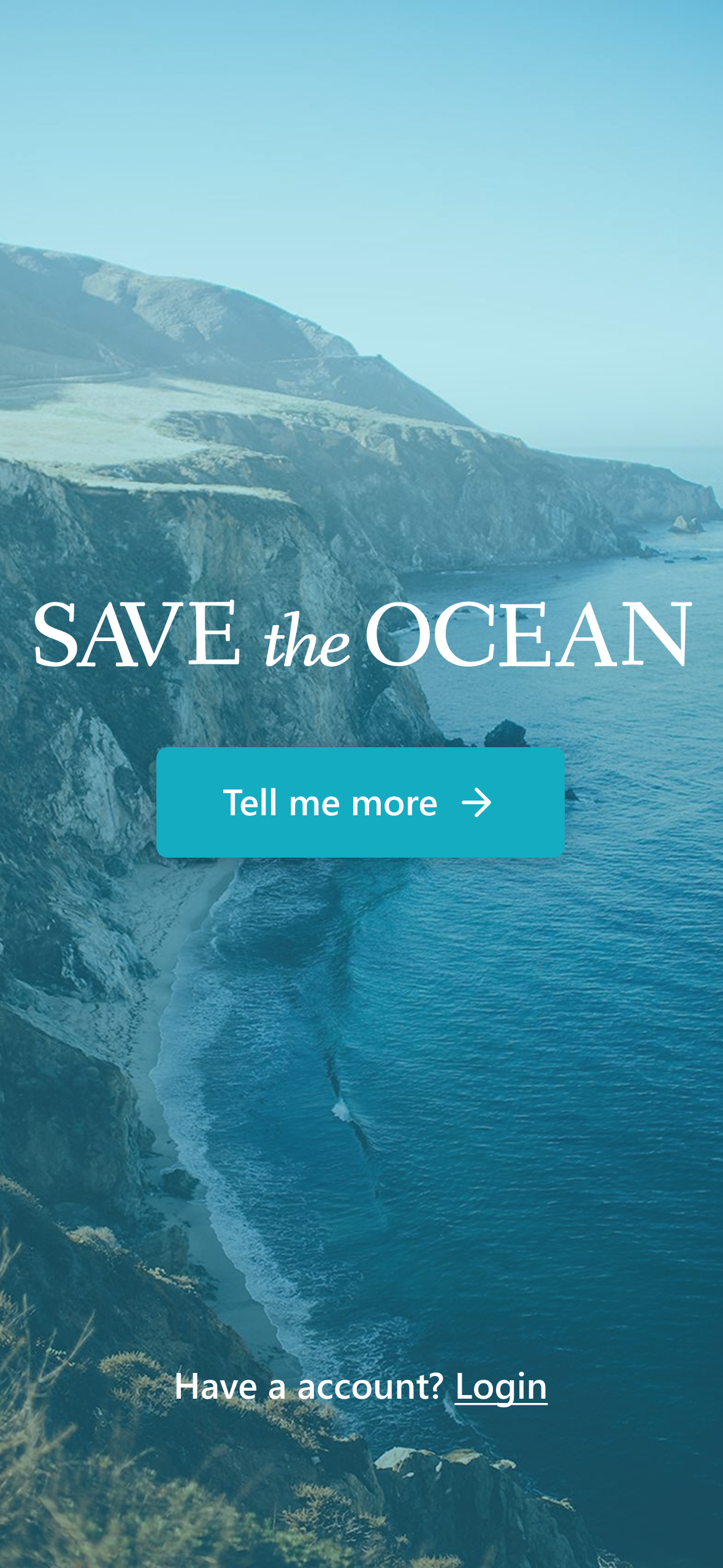
The save the ocean app was design to help people reduce single-use plastic in order to help reduce plastic pollution.
The problem
Pollution from single use plastic
The goal
Create a mobile app to help people make lifestyle changes to reduce the use of single-us-plastic
My role
UX/UI designer Researcher
Responsibilities
Research, paper and digital wireframing, low and high-fidelity prototyping, conducting usability studies, accounting for accessibility, iterating on designs, determining information architecture, and responsive design
Project dates
January 2023 - Feb 2023
Understanding the user
Research
Statistics
1. Plastic waste generated in coastal regions is most at risk of entering the oceans
In 2010 coastal plastic waste generated within 50 kilometers of the coastline amounted to 99.5 million tones.
2. A study found that plastic fibers were present in 83% of tap water samples worldwide
US and Lebanon residents were most likely to find plastic in their tap water, with 94% of samples testing positive.
3. At least 14 million tons of plastic end up in the ocean every year
Plastic makes up to 80% of all marine debris found from surface waters to deep-sea sediments.
Insights
Top concerns about plastic
- Ocean and marine life
- Litter and trash
- Human health
- Climate change
Top barriers for recycling
- Lack of programs/services to enable recycling
- Not knowing how to participate in recycling programs
- Inconvenience of recycling
- Lack of trust in recycling programs
Most adoptable zero-waste practices
- Choosing new products with reusable packing
- Avoiding products that are hard to recycle
- Repairing goods when they are worn or broken
- Consuming less
Competitive audit
An audit of the most notable apps aimed at reducing plastic pollution was conducted to determine what is currently available to help people make changes in their daily lives to benefit the environment, as well as to identify what is missing and could be improved.
click to zoom image
Persona
I created a persona to better understand the target audience, their needs, behaviors, and pain points. This approach helped ensure the solutions were user-centered and effectively addressed real-world challenges.
Julie
28 yr
Marketing Manager
Problem statement:
Julie is becoming increasingly aware of the environmental impacts of plastic waste, but she struggles to adopt sustainable practices due to a lack of accessible recycling programs and reliable information. She wants to make a difference but feels unsure about how to start.
Goals
Reduce her personal contribution to plastic waste
Support companies and products that use sustainable materials and packaging
Frustrations
Finding time to research sustainable options amidst her busy work life is challenging
Lack of trust in the effectiveness of recycling programs makes her feel discouraged
Starting the design
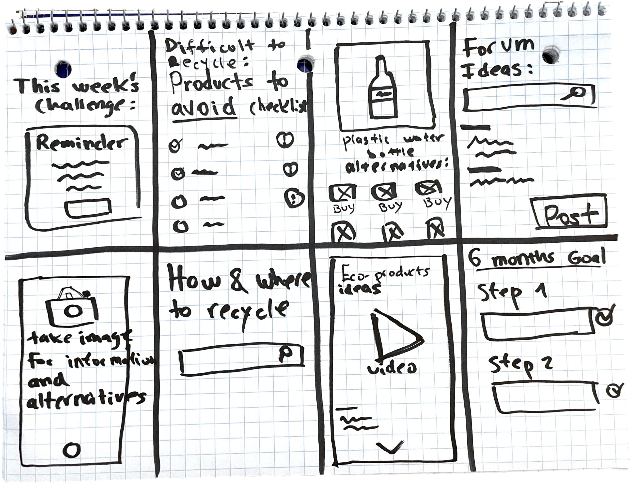
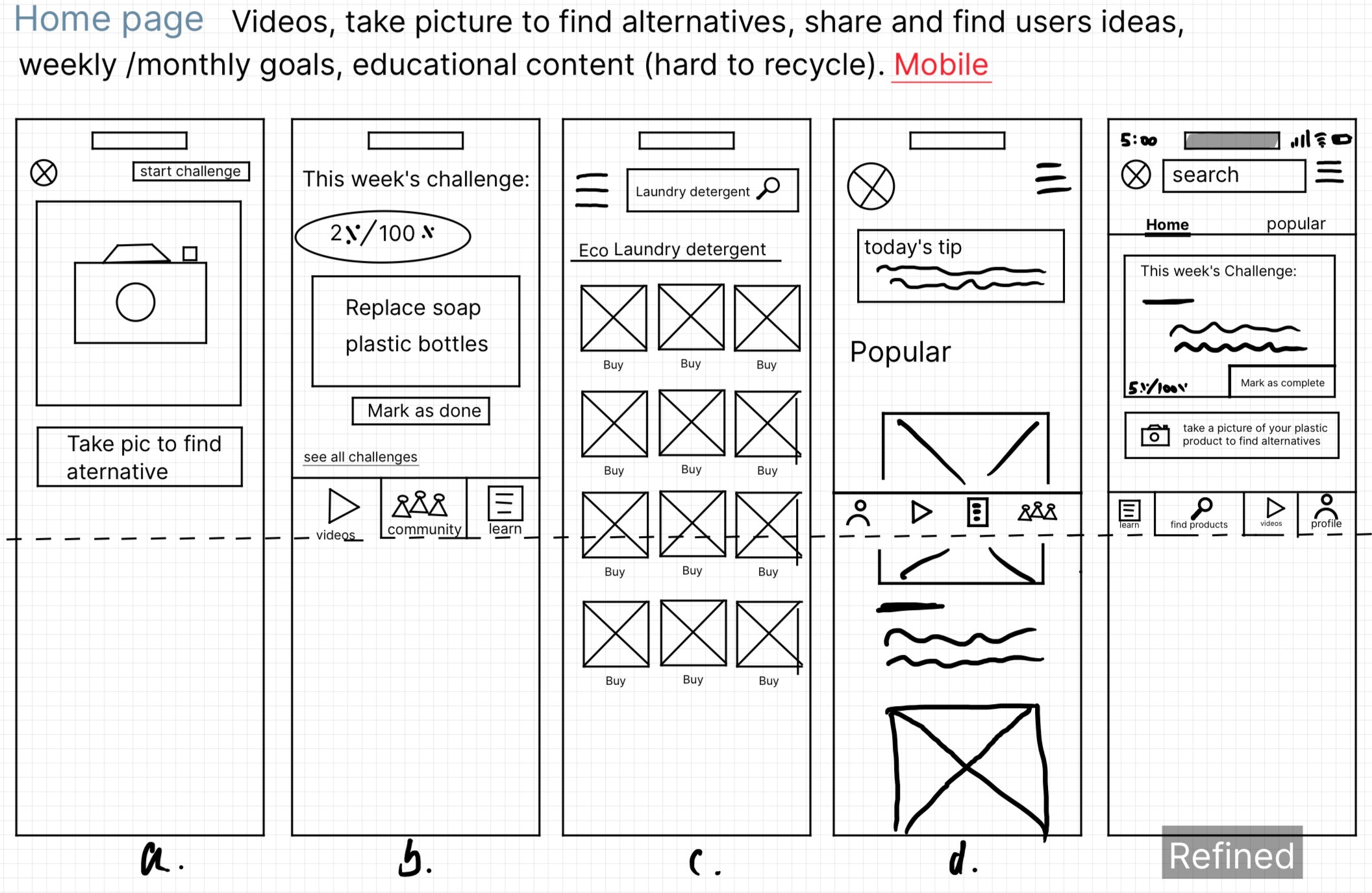
Paper wireframes
Trying out layouts
I sketched out different versions of each app screen to make sure the elements in the digital wireframes solve user problems effectively.
Digital wireframes
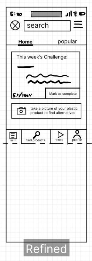
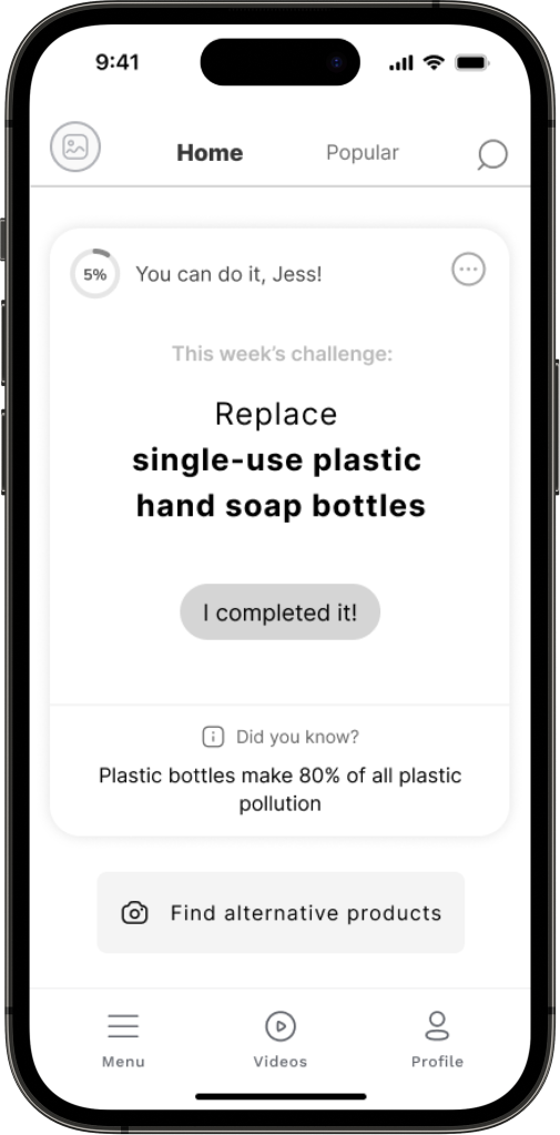
From paper to digital
After ideating and drafting some paper wireframes, I created the initial designs for the save the Ocean app.
Low-fidelity prototype
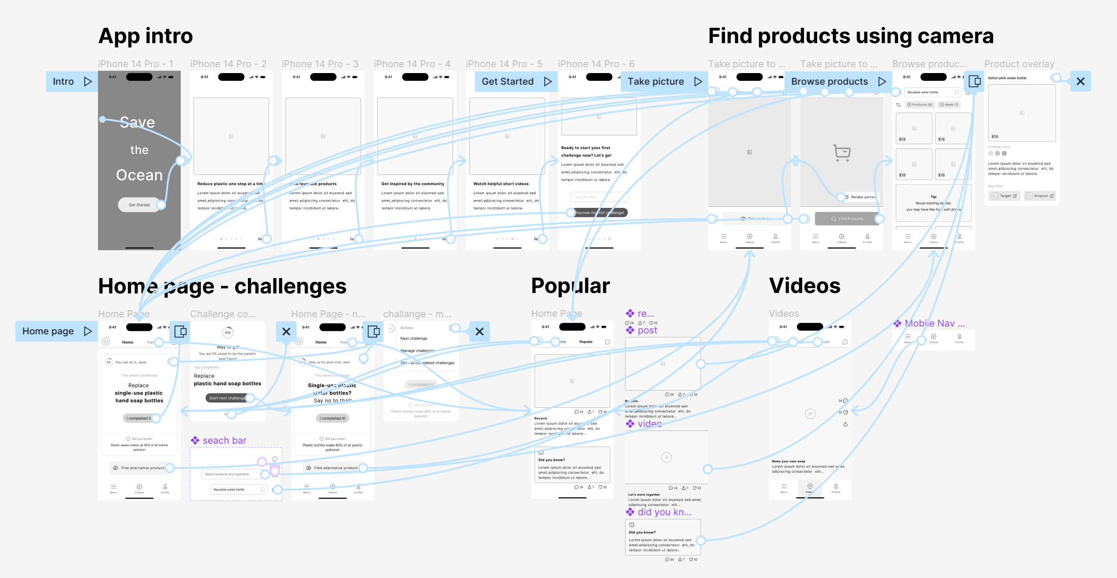
Creating interactive prototype
To prepare for usability testing, I created a low-fidelity prototype that connected the user flow of getting started with the app, completing a challenge, finding products using the camera, viewing popular posts, and watching videos.
Testing
Usability Study Parameters
Study type:
Moderated
Location:
Remote, online
Participants:
3 participants, ages 20-30
Length:
15-25 min with each participant
Usability Study Findings
Users didn't fully understand what they would see in the 'Popular' tab
Users didn't understand what the picture icon was doing in the 'search alternative products' button and why do they have to take a picture
Users were not sure what types of videos they would see and why it was redundant with the videos on the 'Popular tab'
Some of the descriptions weren't clear enough and users felt the need for more headings
Refining the design
Homepage mockup
Changes were made based on the insights from the usability study
Changes:
- The information in the challenges section was reorganized
- Recommended products related to the challenge were added and displayed when scrolling down on the homepage
- The navigation was rearranged and redesigned
- Wording was improved

Before

After

Community page mockup
I also updated the design for the community page after the usability study
Changes:
- The ‘popular’ tab that was confusing users was renamed ‘community’ and moved to the fixed bottom navigation bar.
- Videos have been moved to the community page and a content filter has been added for users to choose what they see.
- A search bar and a ‘post’ button were added.
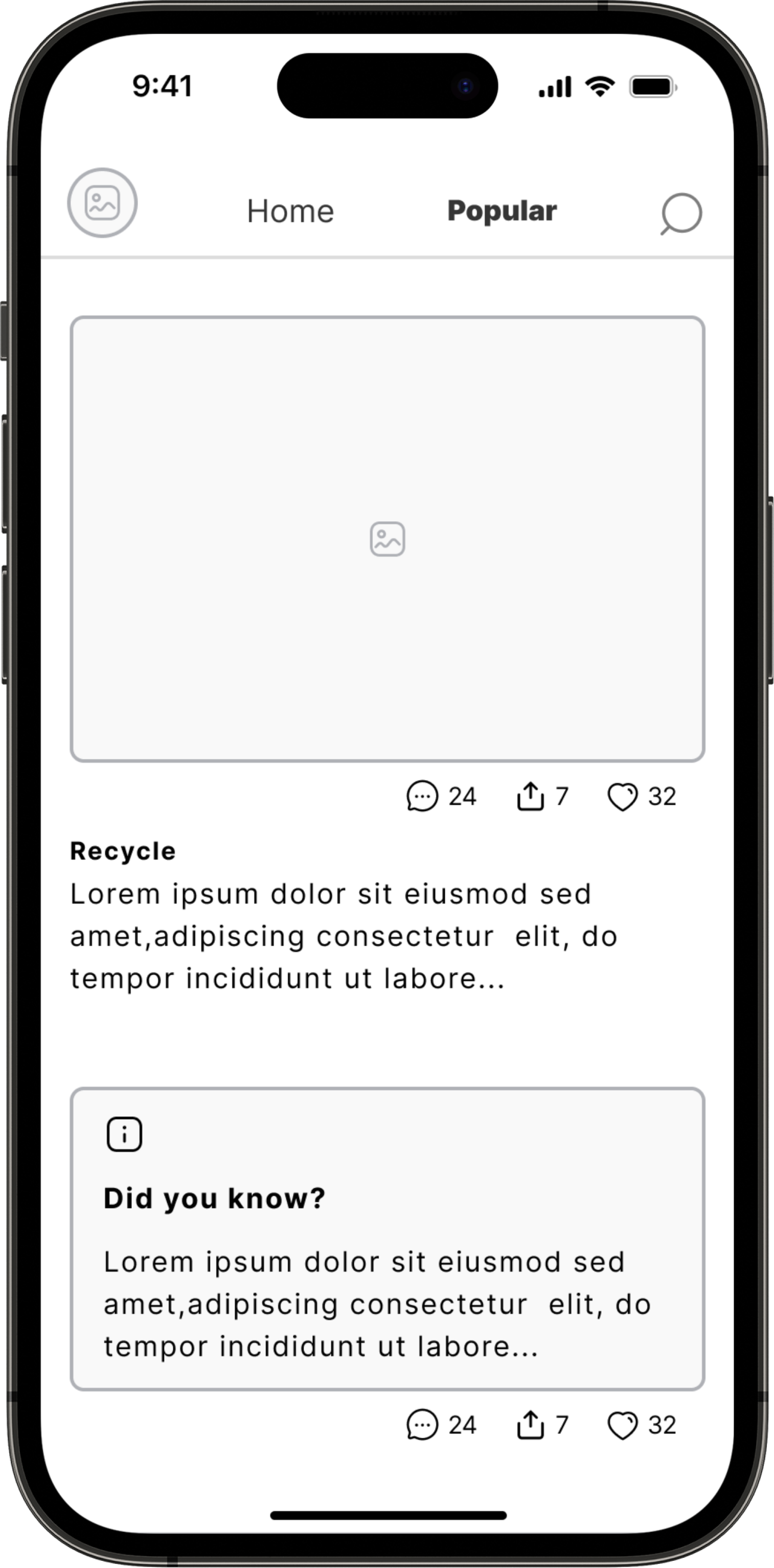
Before
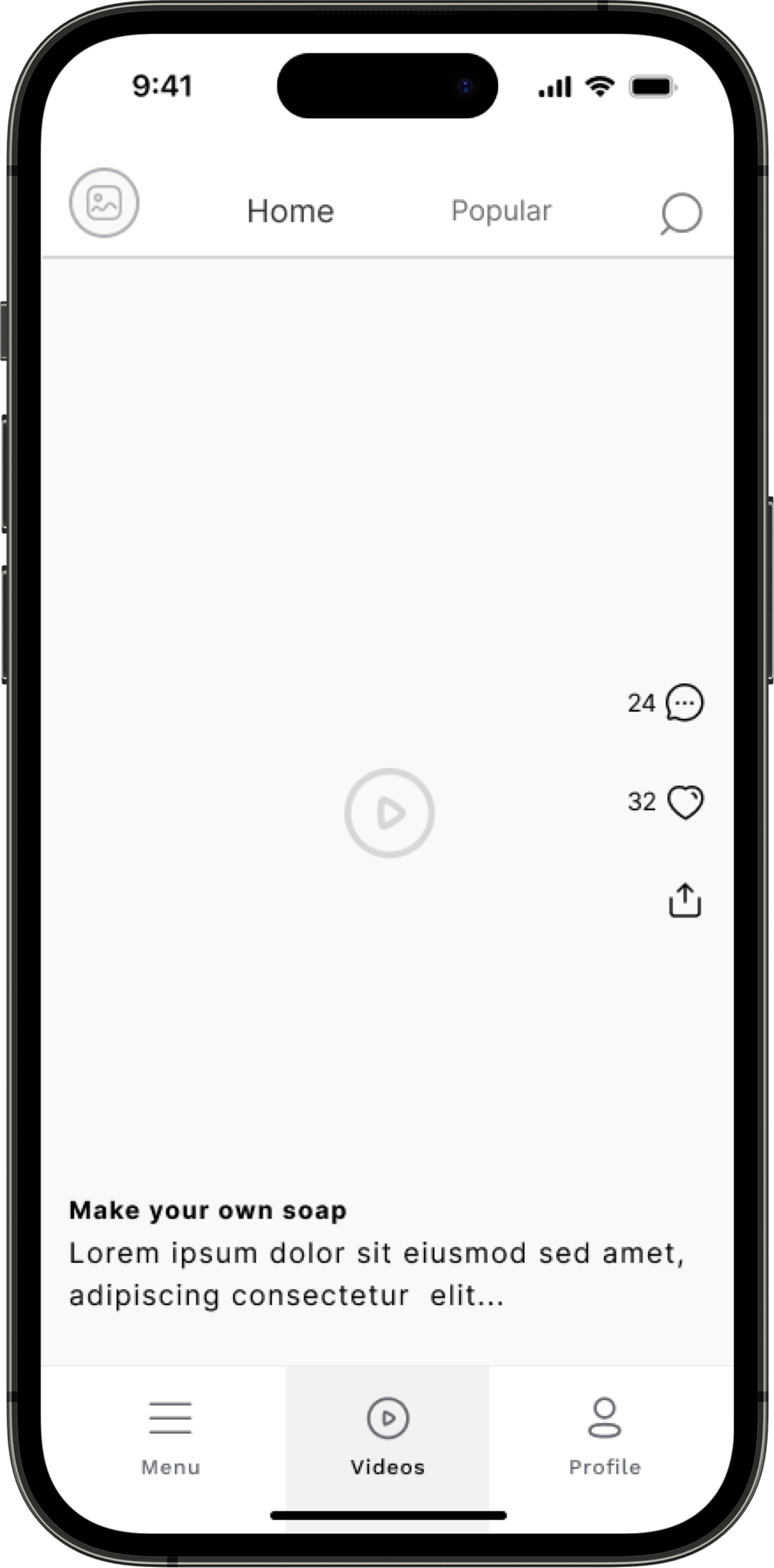
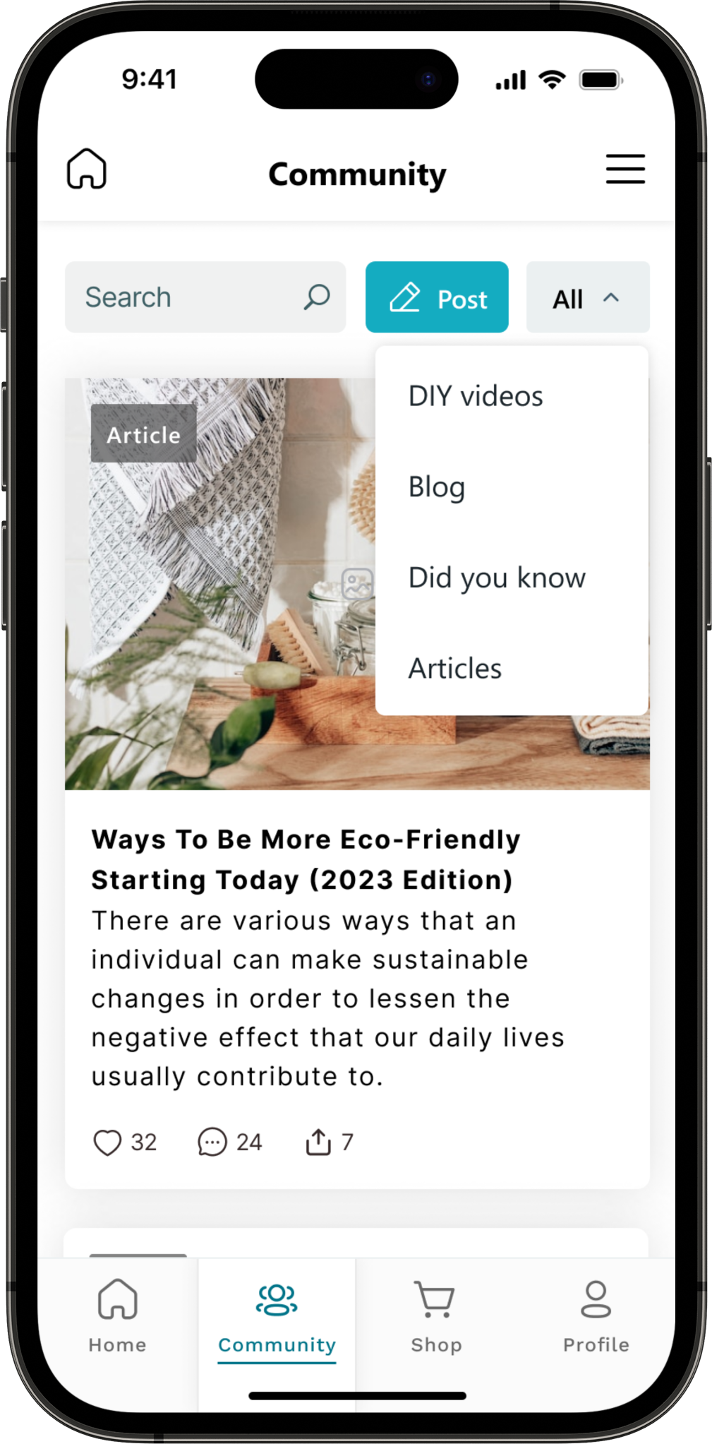
After
Mockups
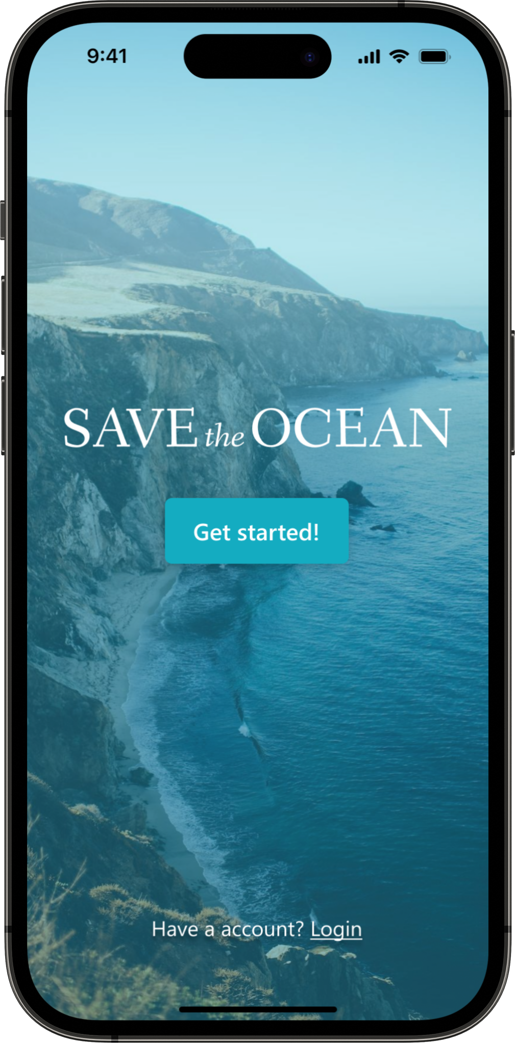
Onboarding
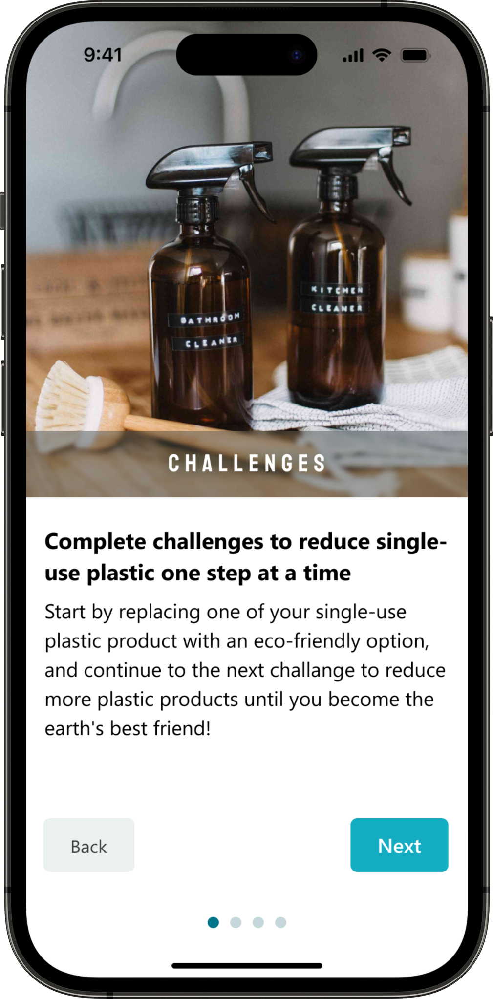
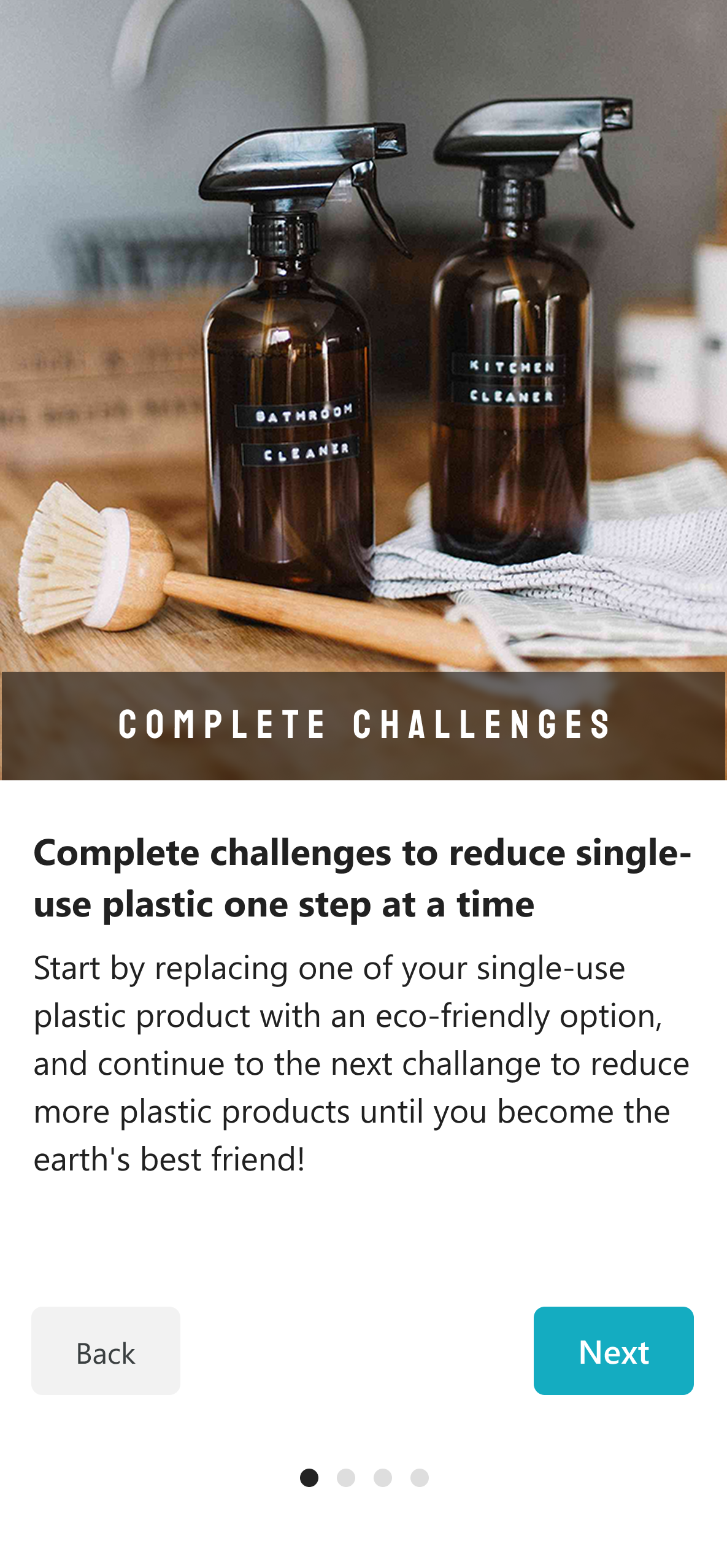
Intro to challenges
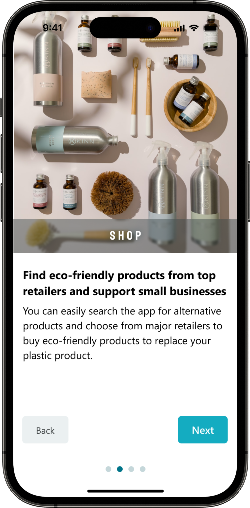
Intro to shop
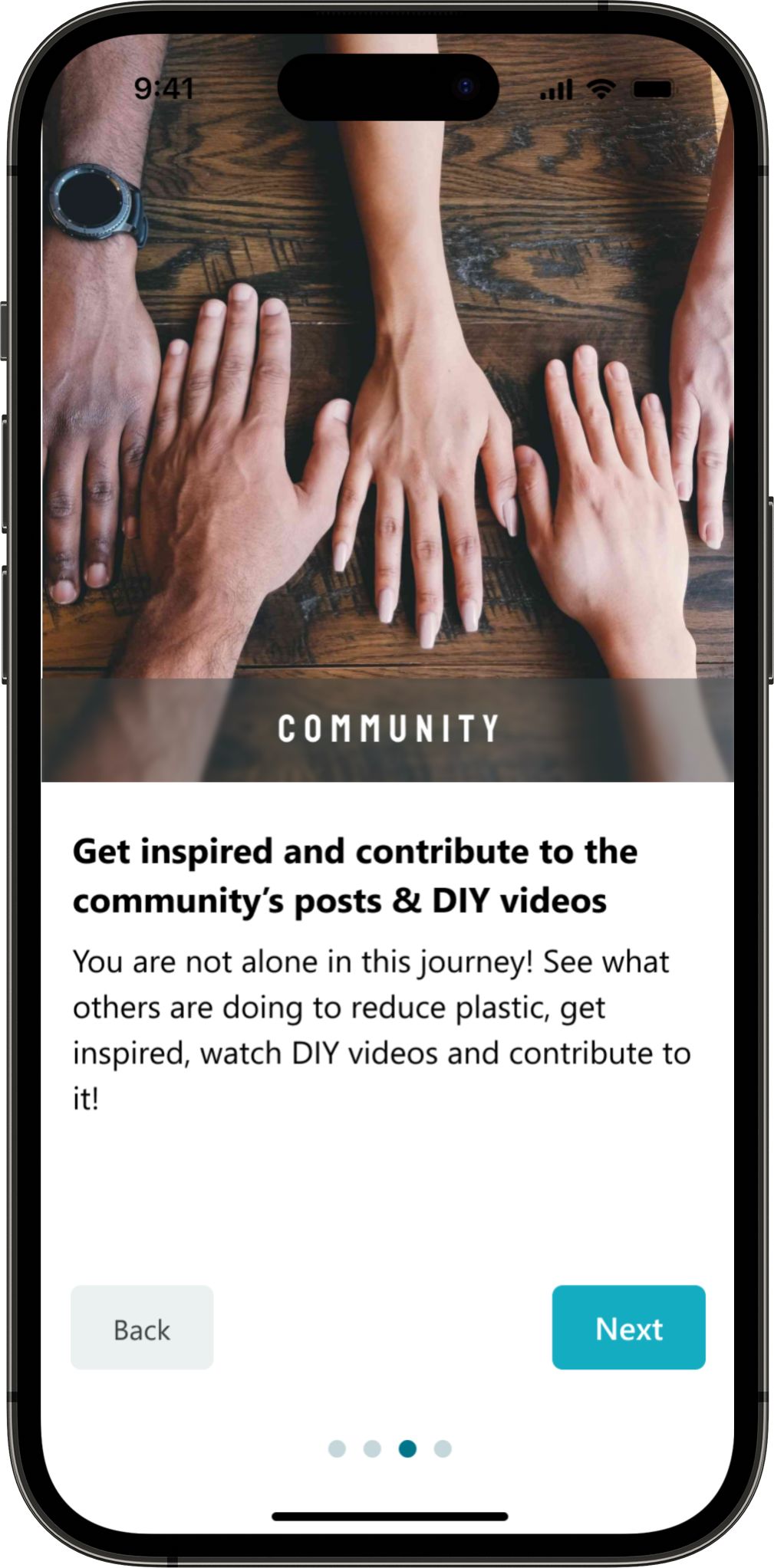
Intro to community
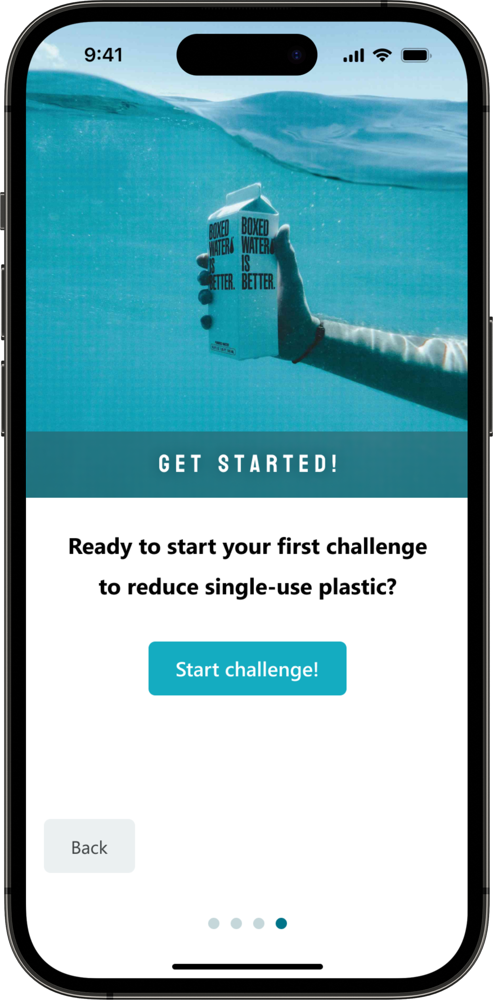
Start challenge

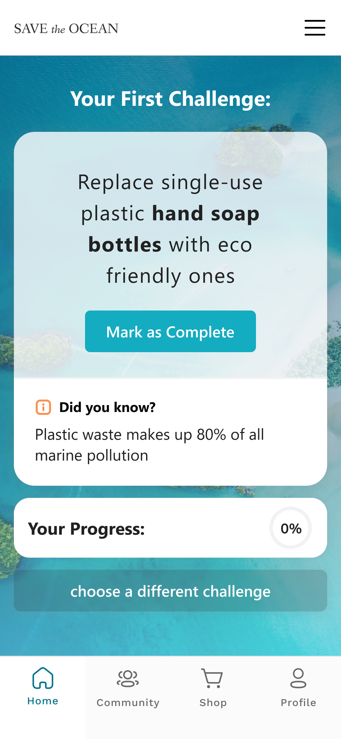
Home page
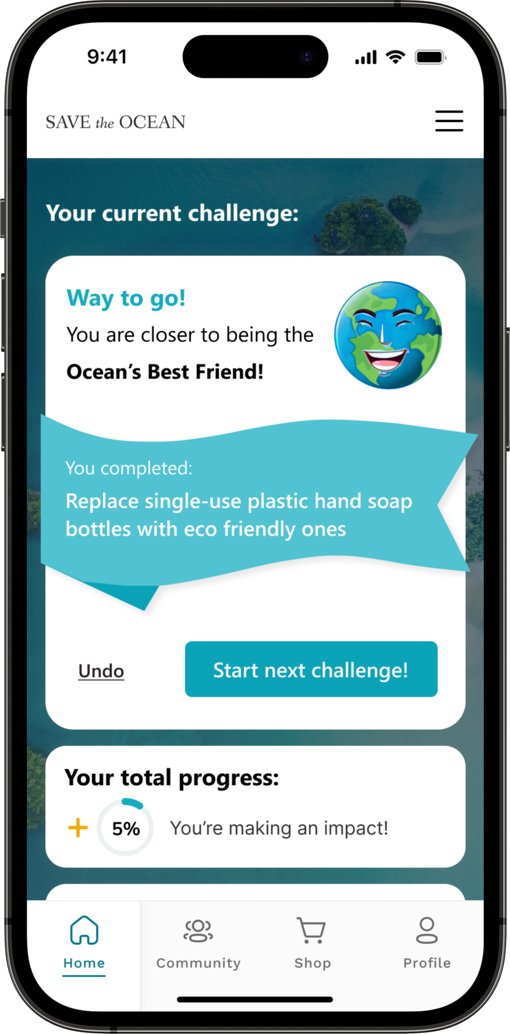
Home page – challenge completed
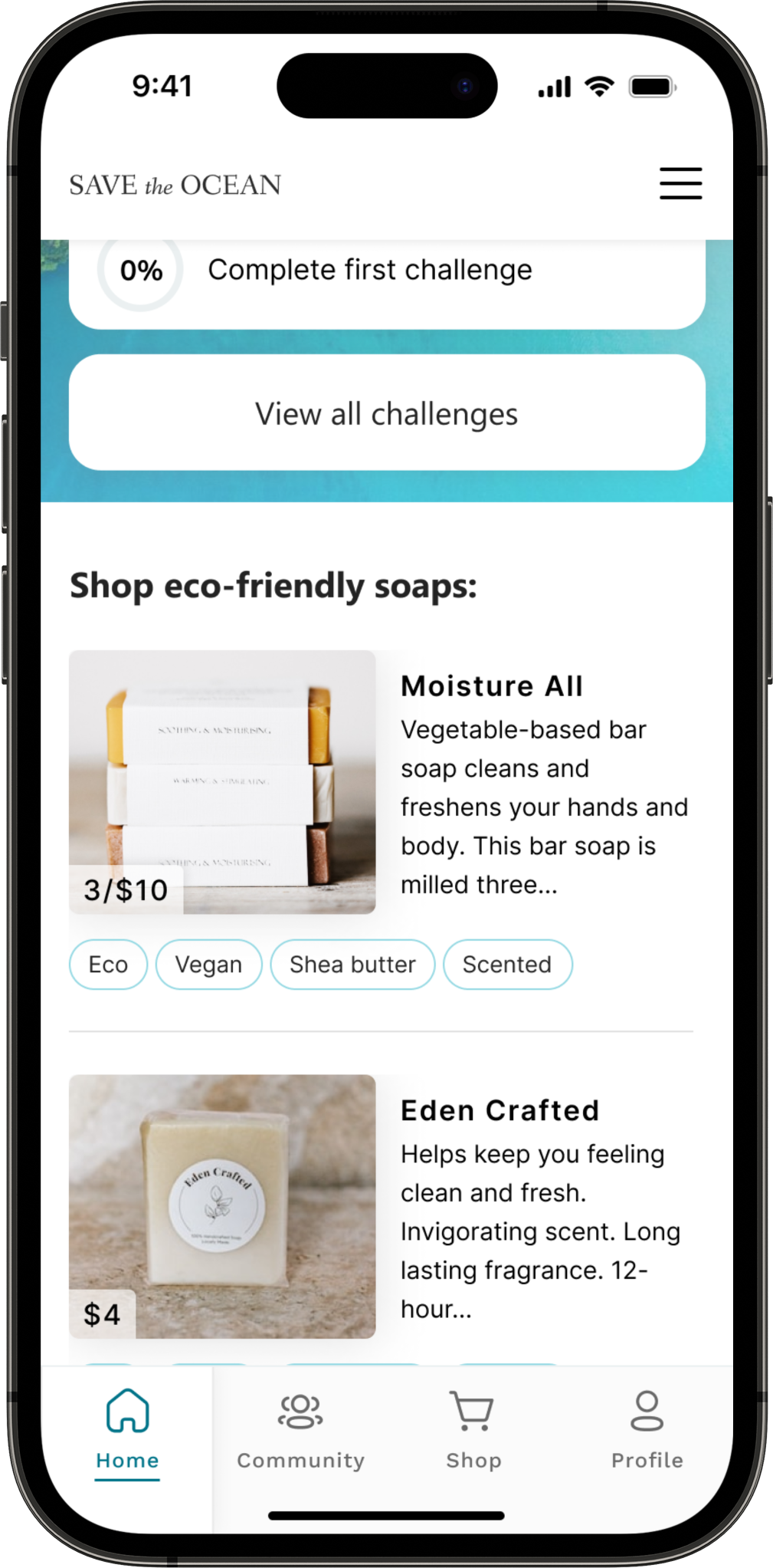
Home page – related recommended items to shop
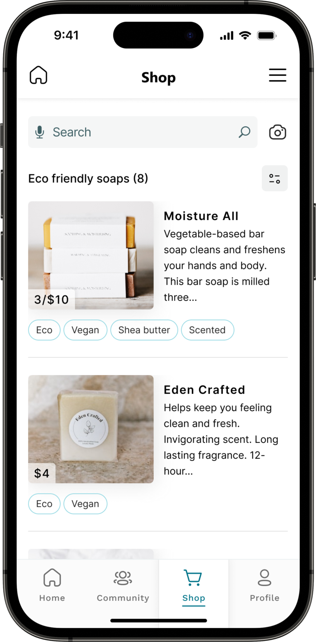
Shopping page
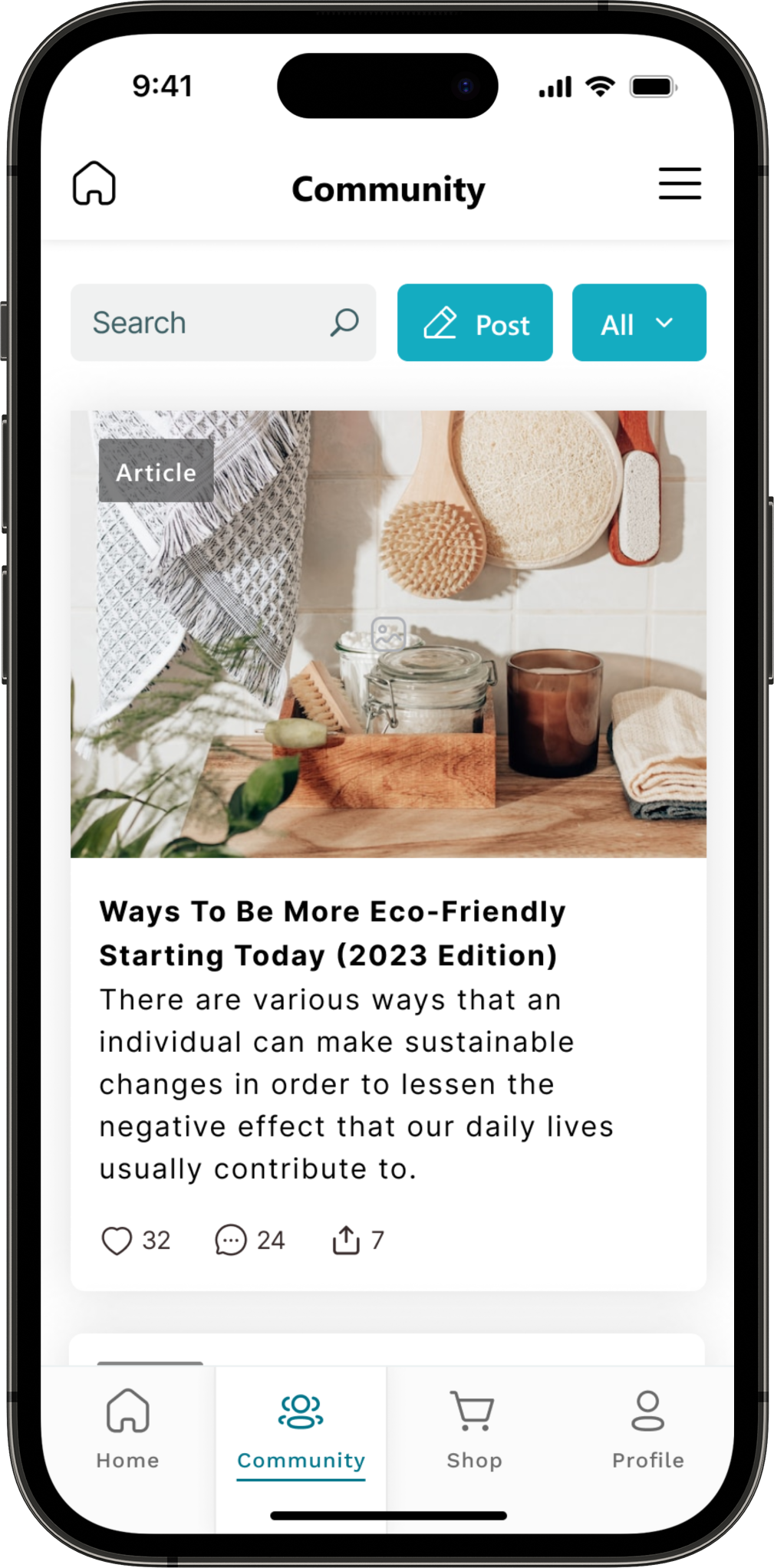
Community page
High-fidelity prototype
The high-fidelity prototype followed the same user flow as the low-fidelity prototype and include the design changes made after the usability study.

Accessibility considerations
Headings & labels were used to organize the content and support assistive technologies.
Color combinations with enough contrast were used so the content is easy to read, and main actions stand out.
Going forward
Takeaways | Next steps
Takeaways
Impact:
The app encourages people to believe that there is a feasible way to become more environmentally friendly and motivates them to make a positive impact on the environment.
In addition, the app considers the psychological impact on people who feel overwhelmed by the number of changes they need to make, by providing a gradual process along with easily accessible resources for finding alternative products.
What I learned:
Before starting any project, I usually have big ideas and unconventional dreams for the design, and it was not different in this project. However, this project helped strength my understanding of sticking to the core design principles that people are familiar with to facilitate the user eperience, like, the traditional navigation bar and the way sections are divided. Also, I paid a special focus on pycological effects the user might experience while using this app progressive disclosure to help users not get overwhelmed by the amount of tasks they were supposed to complete.

