Project overview
The product:
The Florist Seattle app was designed to complement in-person shopping during the Covid-19 pandemic to support normal operations while complying with government restrictions.
Project duration:
July 2021 - November 2021
The problem:
The florist store is unable to continue normal operations, and customers are disappointed at not being able to shop as usual.
The goal:
Design a mobile app to enable online ordering to maintain sales and continue serving customers while complying with government restrictions.
My role:
Product designer leading the app from conception to delivery.
Responsibilities:
Conducting interviews, paper and digital wireframing, low and high-fidelity prototyping, conducting usability studies, accounting for accessibility, iterating on designs, determining information architecture, and responsive design.
Understanding the user
User research | Personas | Problem statements | User Journey Map | Competitive audit | Ideation
User Research
Interviews:
To empathize with users, I interviewed five users who buy flowers about once a month to find what are the most important things to them and what are their pain points with the services currently available. Then, I created empathy maps to better understand their needs.
User group:
I initially assumed that the main group of users would be those who normally shop at local florists and needed an alternative way of shopping due to government restrictions. However, I also found a second group of users that use florist apps to place orders from a remote location to deliver bouquets for special occasions.
Confidence to buy flowers online:
For users to feel confident buying flowers online, they need information such as the freshness and smell of flowers, especially since going to the store provides this information easily and quickly.
Outdated apps:
Most users think the currently available florist apps are outdated and don’t provide a good user experience. Users also mentioned that in order for them to choose to shop online rather than in-store, the app would need to provide additional value, such as saving items to buy later and having a purchase history to shop based on previous favorites.
Summary
Lack of information
It is more challenging to buy flowers online without being able to know what the freshness and smell of the bouquet will be.
Poor Navigation
Most available apps are outdated and difficult to navigate.
Store access
Government restrictions limit access to stores.
Persona 1
Problem statement:
Jessica is a full-time employee who needs an alternative way of shopping because of government restrictions on in store shopping.
Jessica
30 | Seattle, WA | Single | B.A. in English | Secretary
"Despite restrictions due to the pandemic, I'd like to be able to continue buying my weekly fresh-cut bouquet to brighten up my apartment."
Goals
Avoid going to stores to prevent the spread of the Covid-19 virus
Find an easy-to-navigate mobile app
Shop weekly for bouquet
Frustrations
“I wish florists would offer convinient alternatives to shopping in stores.”
“I’m disappointed at to being able to find a modern and easy-to-navigate local florist app.”
“I usually can’t find all the information I need to buy flowers online with confidence.”
Bio
Jessica is a 30-year-old executive assistant with a bachelor’s degree in English who is single and lives in a studio in Seattle, WA. On Fridays, she likes to buy a fresh-cut bouquet to brighten up her apartment. Due to pandemic restrictions, Ayleen is sad about not being able to shop for her weekly bouquet and wishes there was a convenient alternative. In addition, she finds the apps for local florists outdated and difficult to navigate.
Persona 2
Problem statement:
Ivy is a college student who needs a reliable and easy-to-use florist app to order from a remote location because she wants to have flowers delivered to her family and friends on special occasions.
Ivy
22 | Pittsburgh, PA | Single | University student | Waitress
"Even though I'm a busy student and part-time waitress on a budget, it's important to me to continue having flowers delivered to family and friends on special occasions."
Goals
Find flower bouquets online to have them delivered to family and friends on special occasions
Stay within budget
Set reminders for special occasions and save addresses for fast checkout
Frustrations
“I wish I could save my friends’ addresses so I don’t have to type them every time I have flowers sent to them.”
“Since I have limited time, I get frustrated when florist apps are difficult to navigate and thus time consuming.”
Bio
Jessica’s family and friends are important to her so she likes to have bouquets delivered to them on special occasions. Ivy prefers to order from local florists to receive the freshest flowers, but she finds most local florist apps outdated and time consuming. Because of Ivy’s limited budget and time, it is important for her to be able to find items within her budget and complete the purchase as quickly as possible.
Ideation
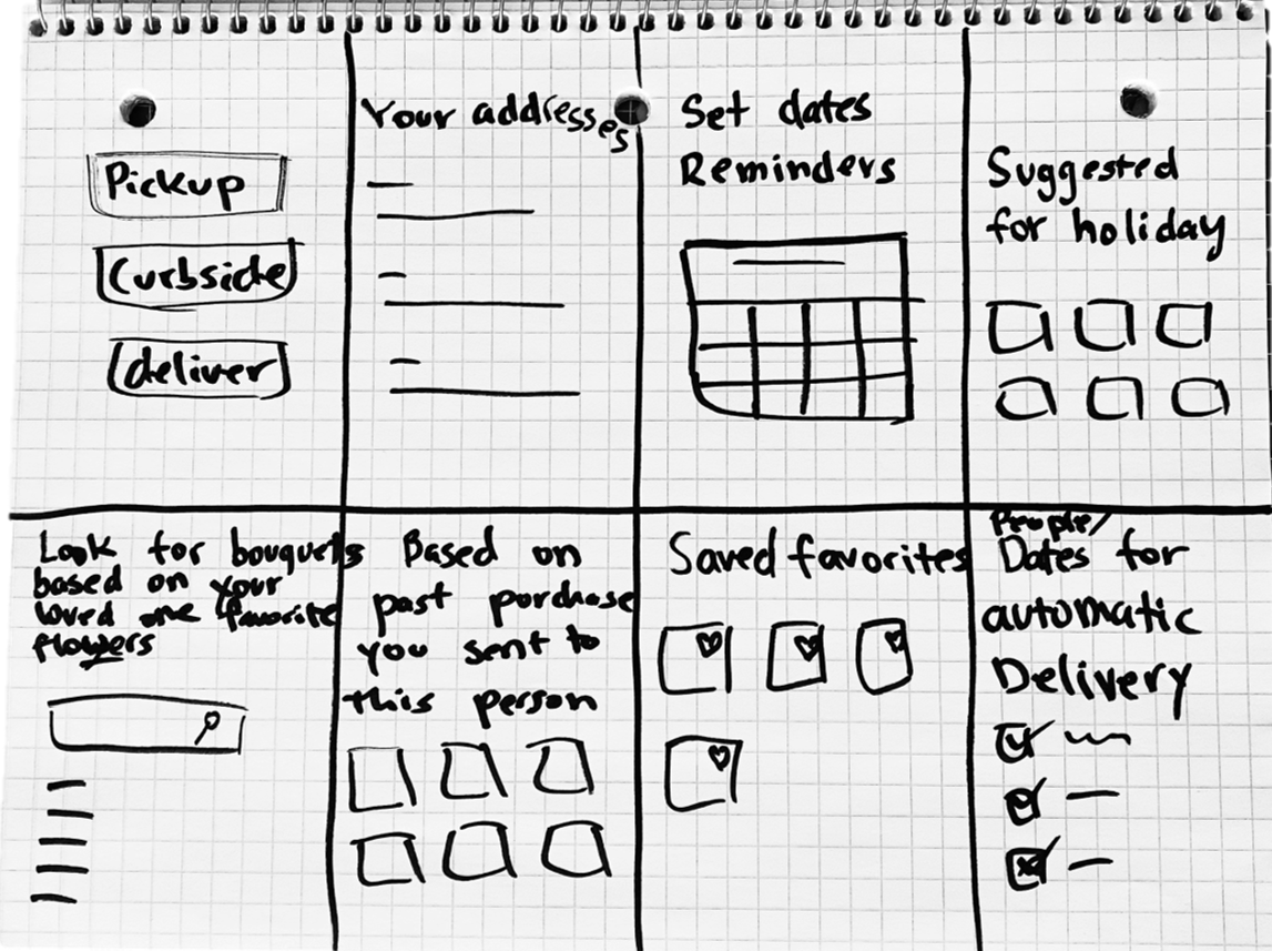
To consider different solutions to the user’s problem of wanting to send flowers to friends and family on special occasions, I used the Crazy Eight method to encourage myself to think of various solutions.
Starting the design
User Flow | Information Architecture | Paper & Digital wireframes | Low-fidelity prototype | Usability studies
Paper Wireframes
Taking the time to draft iterations of each screen of the app on paper ensured that the elements that made it to digital wireframes would be well-suited to address user pain points.
Digital Wireframes
To implement user research findings and interview feedback, I made sure the layout was optimized for easy navigation, items could be filtered, and important notices were displayed upfront.

One of the pain points discovered during research was that users needed additional features to make it worth using the app to replace store purchases. To solve that, I added pages that users mentioned as useful, like items they liked and purchase history, and kept the option to apply more features to the user’s profile.

Since the goal of the store is to get customers to shop primarily online, I added an About Us page to build trust by showing customers who the store employees are and what their flower bouquets generally look like.

Low-fidelity prototype
The low fidelity prototype connected the primary user flow of purchasing a bouquet item, so the prototype could be used in the usability study with users.

Usability study findings
After creating a usability study plan, a moderated usability study was conducted virtually with 5 participants lasting approximately 25 minutes each.
Round 2
Some clickable elements were not understood as such
Users took more time than expected to understand the checkout process
I noticed that filtering items on the home page was not ideal
Accessibility button location was too distracting
Round 2
Wording used in some screens was not clear to users
The checkout process still didn't provide users the optimal experience
The design still needed some updates to improve scanning of information
Refining the design
Mockups | High-fidelity prototype | Accessibility
Mockup: item page
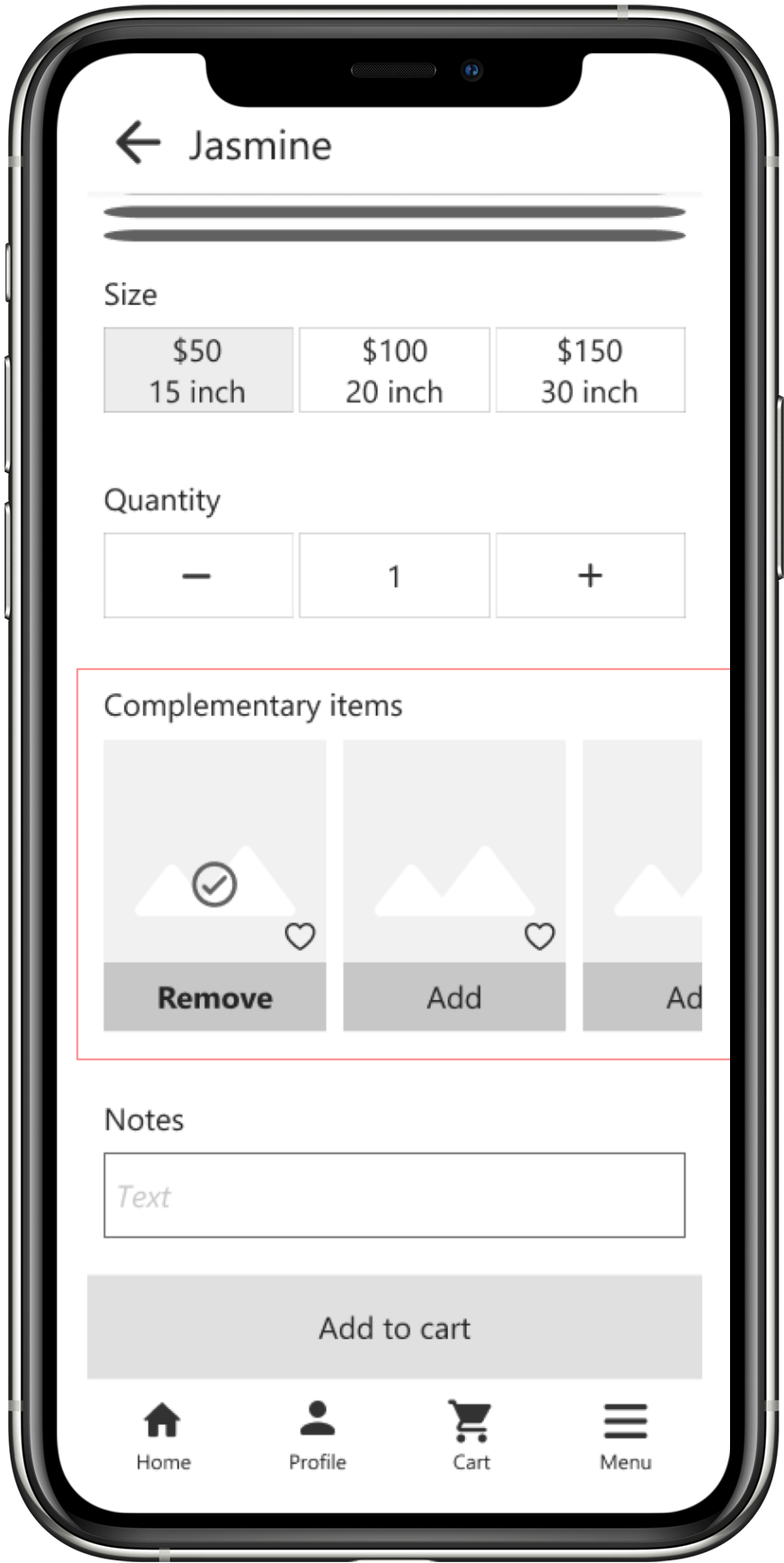
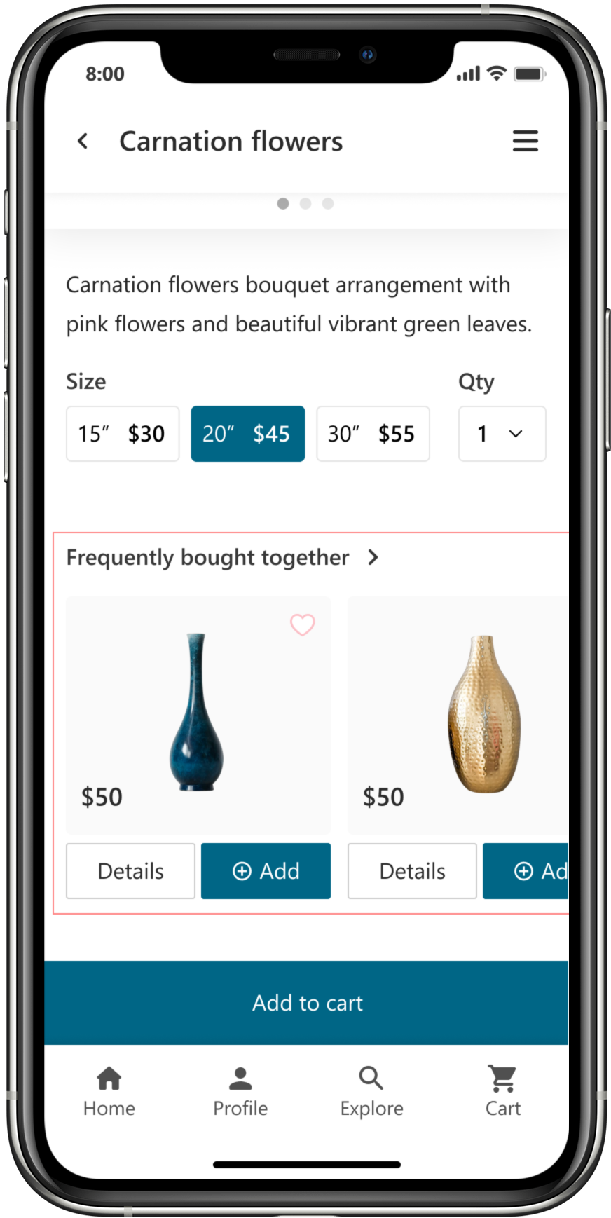
Early designs allowed users to quickly bundle items by clicking the ‘Add’ button.
However, after the usability study, I discovered that users didn’t understand that they could click on the image to see more details and they were also not confident about the heading’s meaning.
Changes:
1) One more button for a clearer navigation.
2) Revised wording to help users better understand the relationship between the main item and the ones that can be added-on.
Before
After
Mockup: checkout
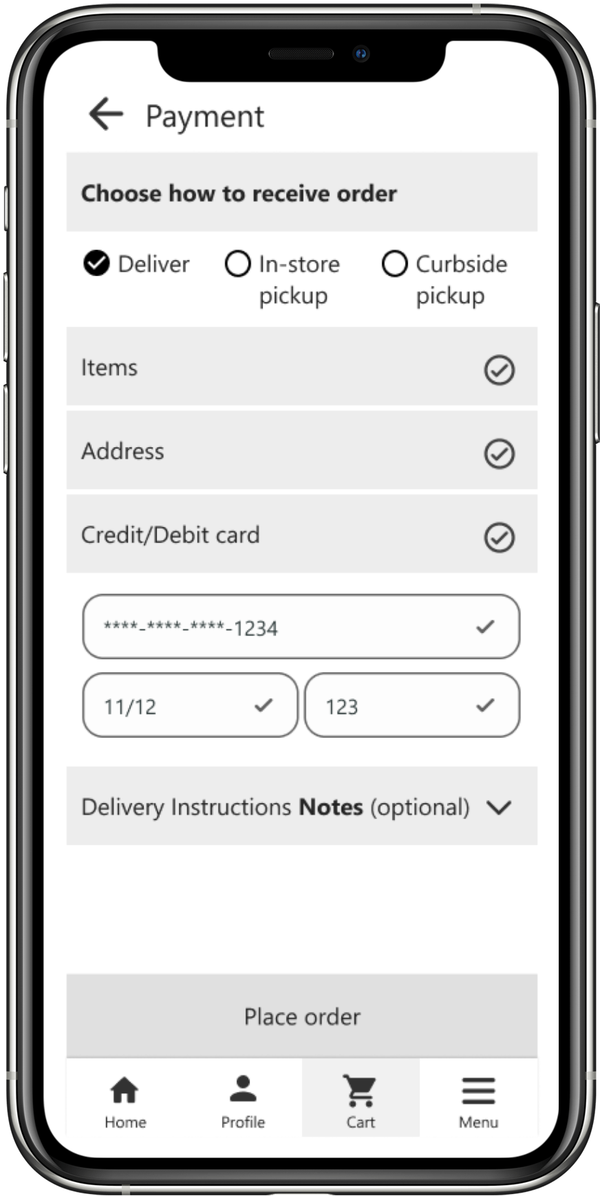
The second usability study revealed that breaking the checkout process to more pages will be more helpful to users than having as few pages as possible.
Additionally, users expected to log in before checking out to speed up the process. So I added an option to log in before paying while keeping a way for guest users to pay without an account.
Before
Checkout page
After
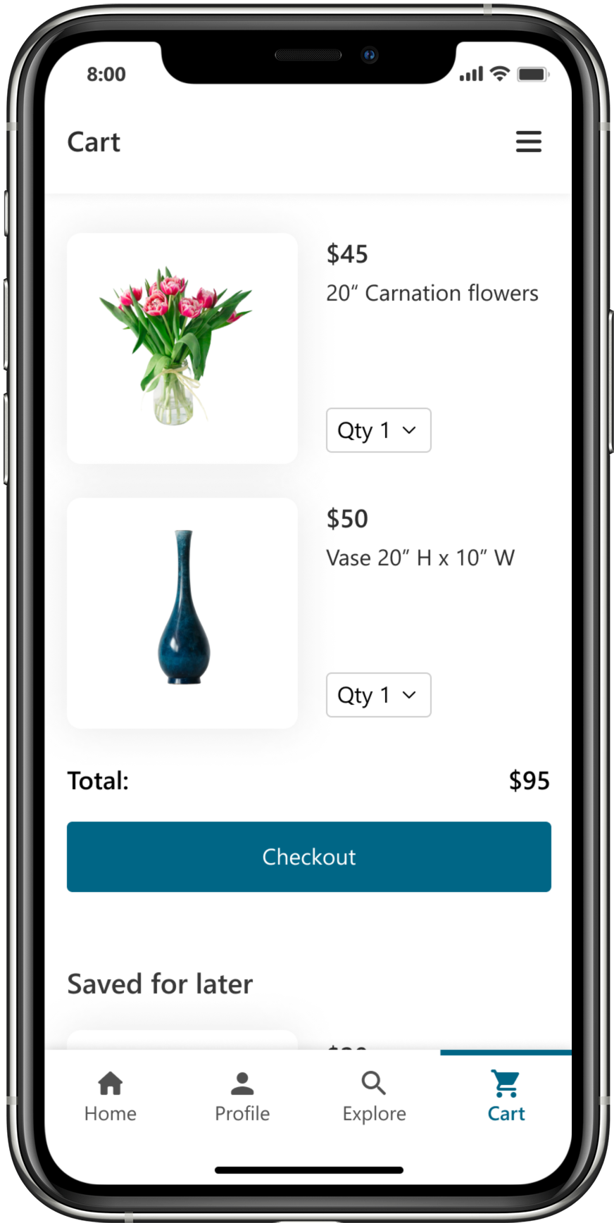
New page for cart
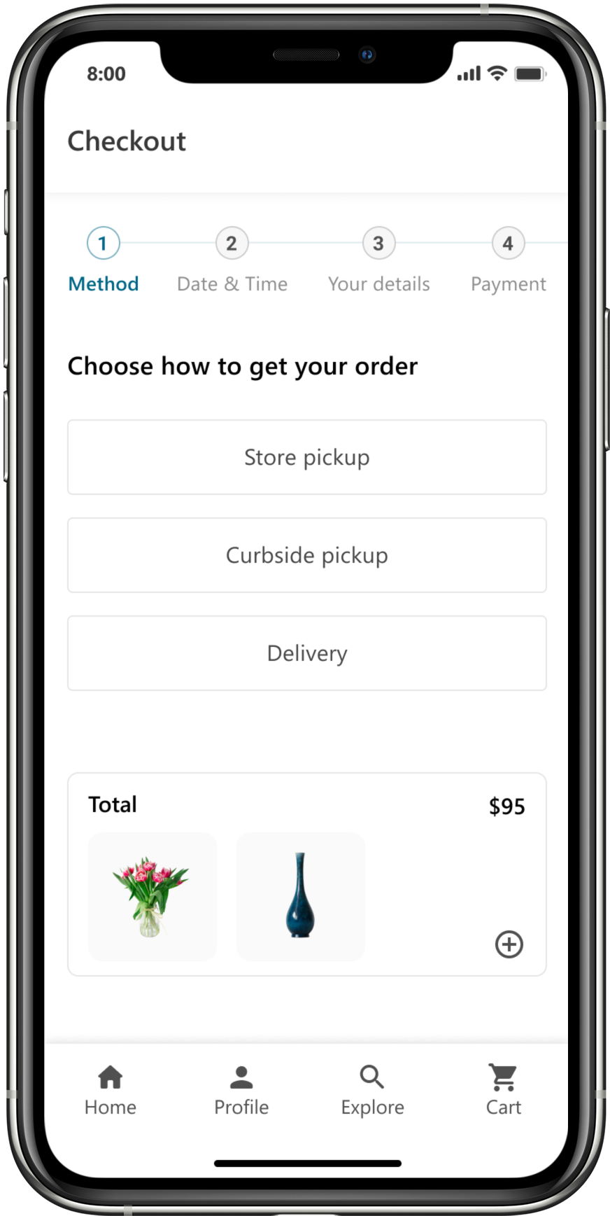
Checkout 1

Checkout 2
Mockups
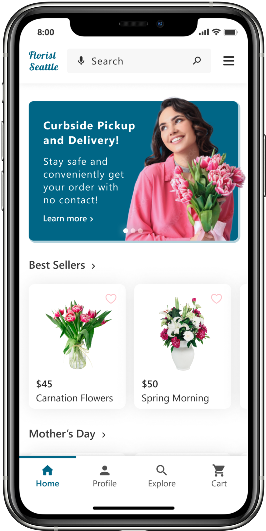
Home page
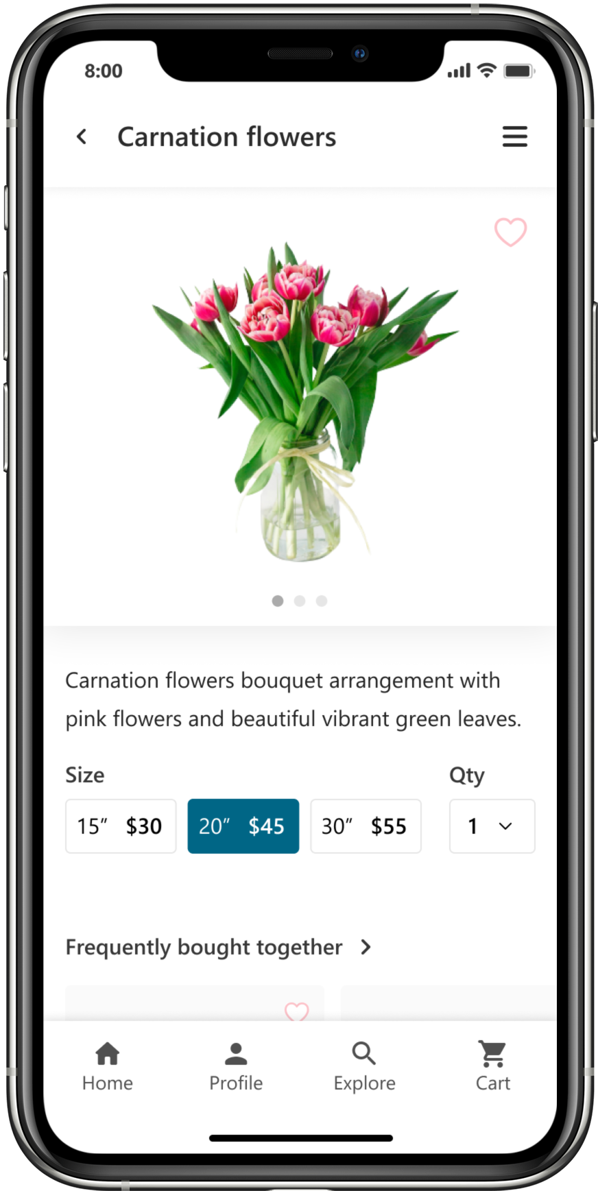
Item page
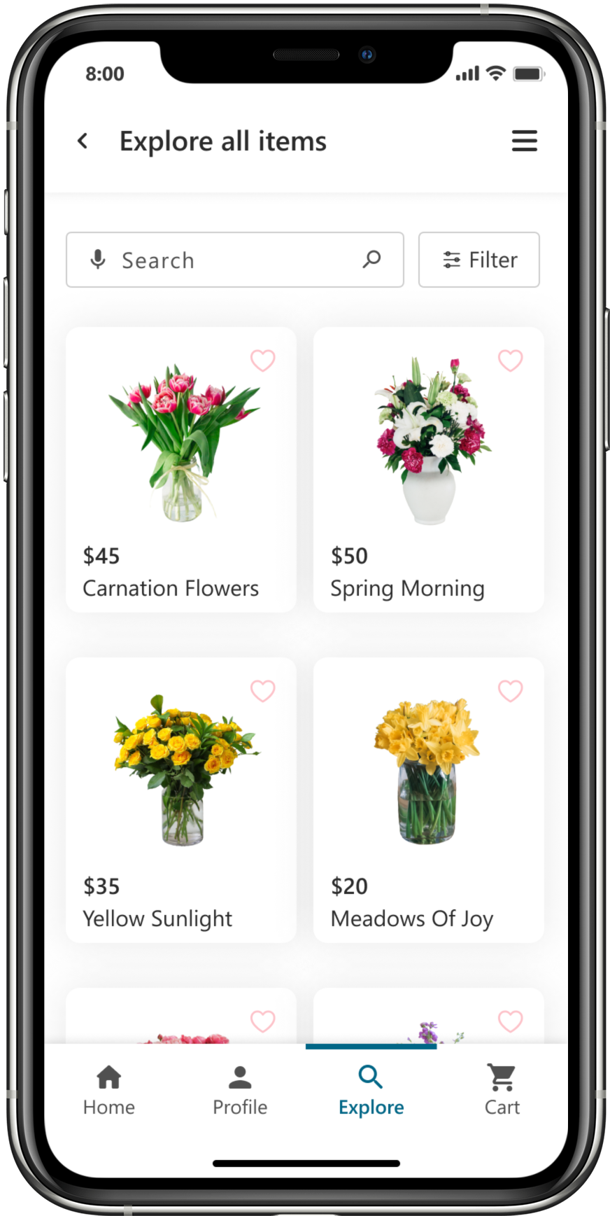
All items page

Cart

Checkout – Method
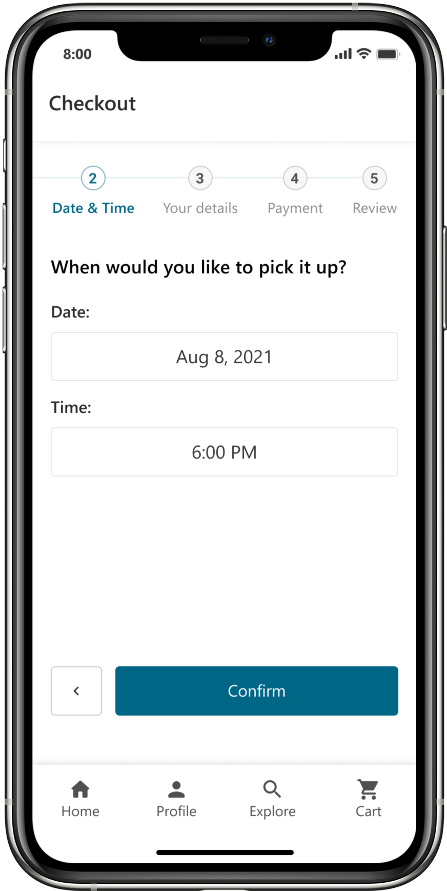
Checkout – Date & time
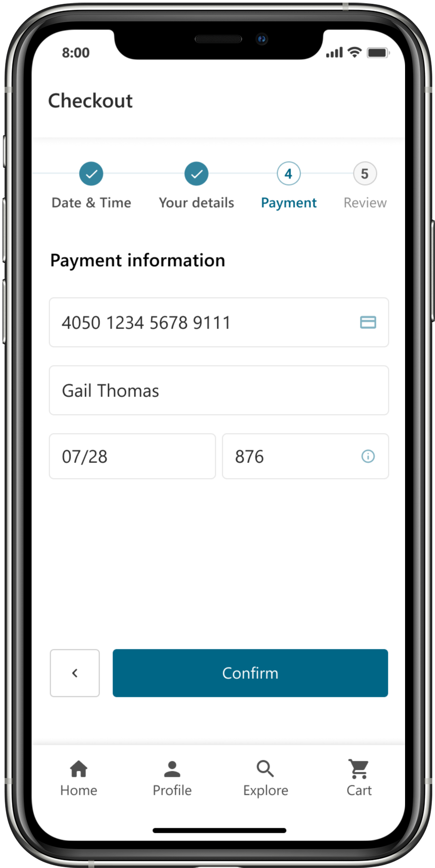
Checkout – Payment
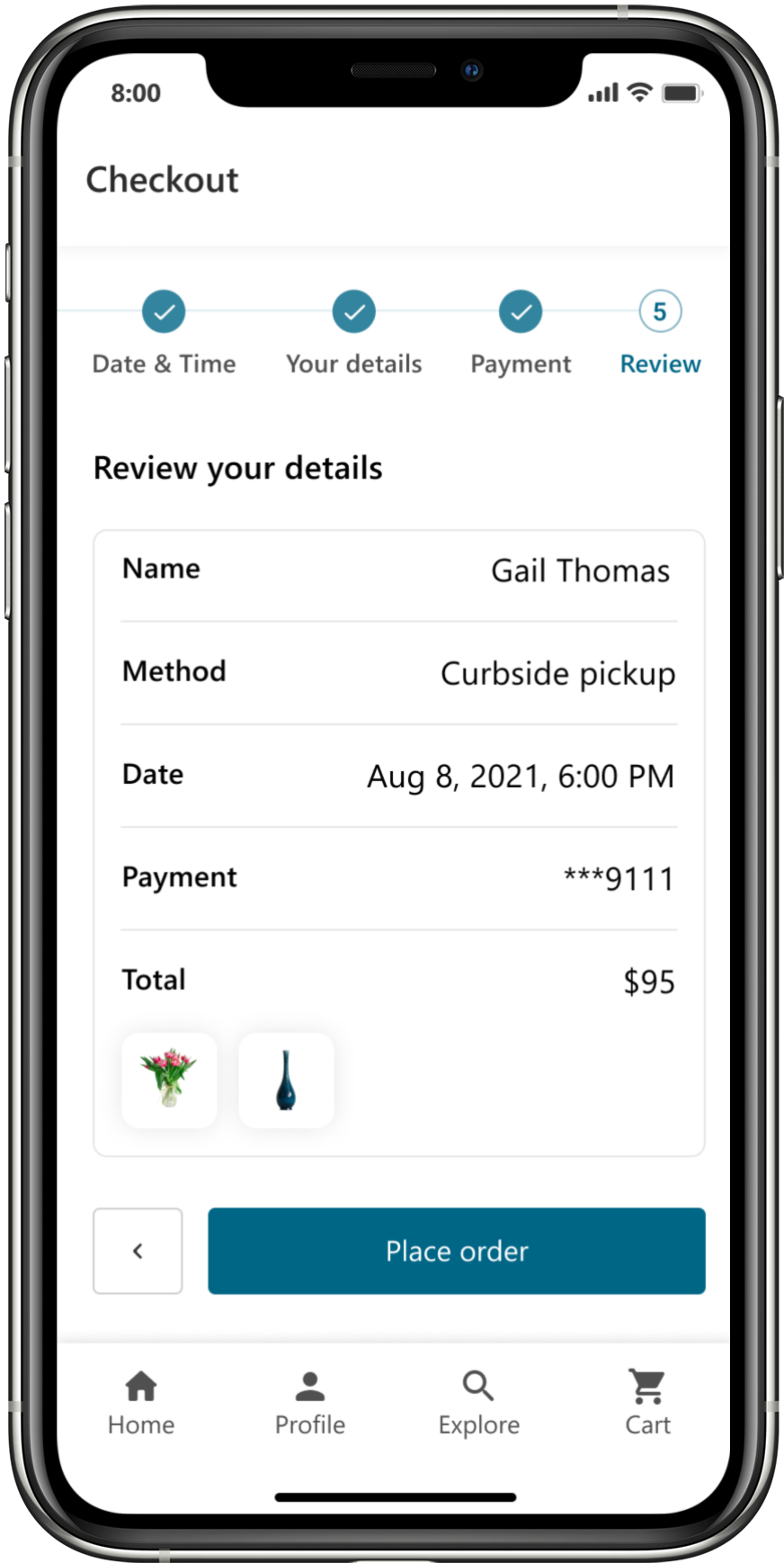
Checkout – Review
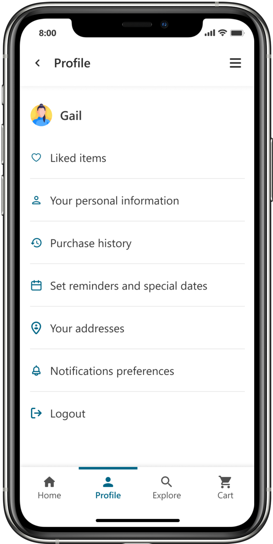
Profile
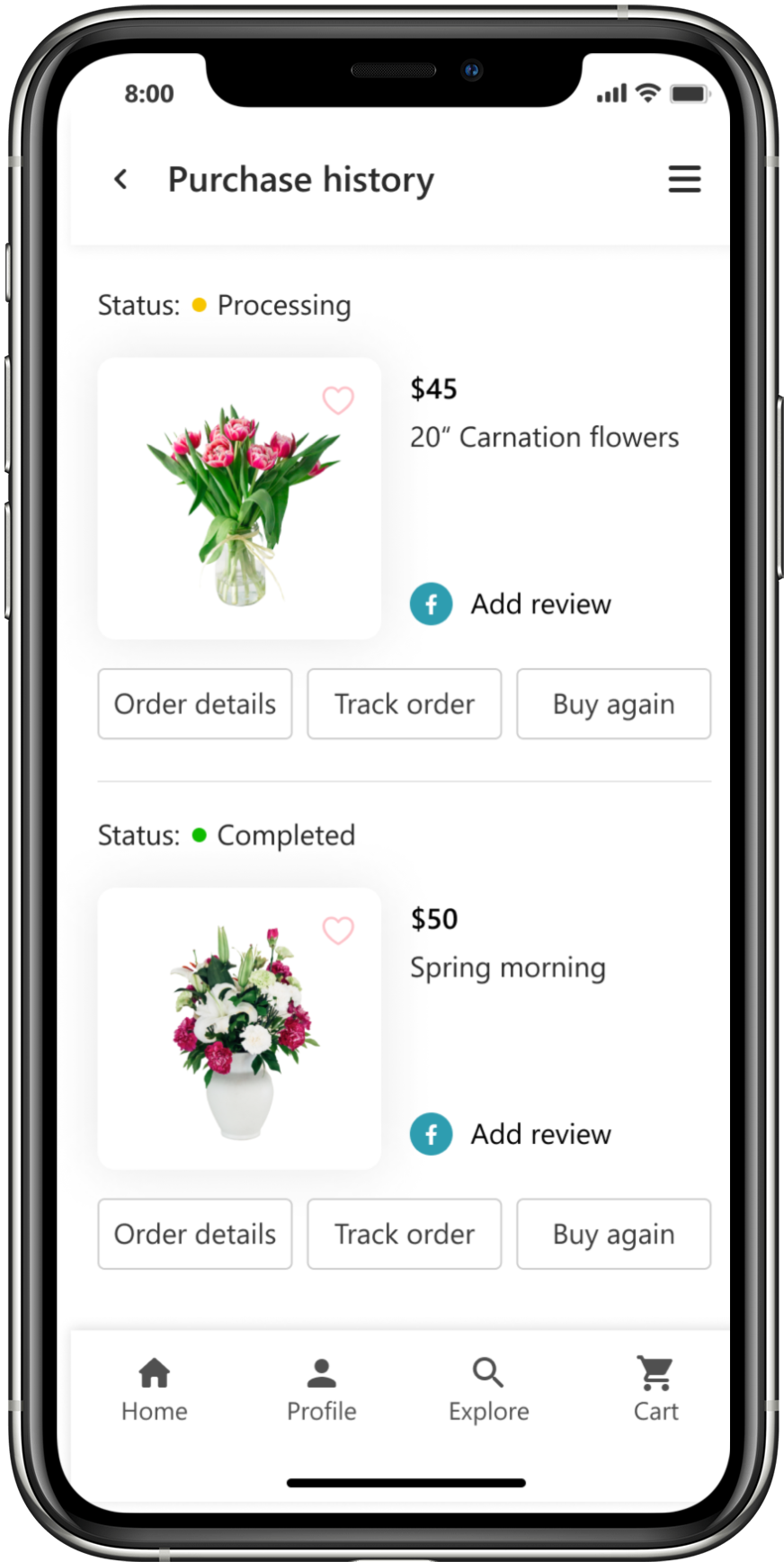
Purchase history
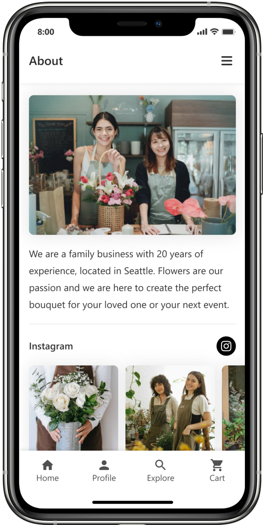
About page
High-fidelity prototype
The High-fidelity prototype connects the user flow and represents the final product.

Accessibility considerations
Color & Contrast
Color and sufficient contrast were applied to ensure usability
Accessibility settings
Accessibility settings were included to allow users to modify the app's design, such as font size
Elements size
Buttons and icons were designed to meet the motor abilities of users
Going forward
Takeaways | Next steps
Takeaways
Impact:
This case was designed as part of Google's UX design course. It represents the importance of developing good online shopping experiences to be prepared and able to adapt to dynamic life situations. As in this case, stores need to be able to adapt in a global emergency like a pandemic, to maintain sales, keep customers safe, and comply with government regulations.
What I learned:
This project was my first project following a defined design process, as well as my first mobile app design. This project taught me the importance of conducting user research and usability studies throughout the design to keep improving and refining solutions to user pain points. As a result, I was able to see the impact it had on the quality of the final product and its ability to effectively meet real user needs. This project was also a learning experience for me in time and scope management. Being my first mobile design, I learned that it's tempting to keep changing and adding things to the design. At the end of this project, I was more aware of the importance of following the scope of projects.


