Project overview
The product:
The Apartment Hunt website was designed to improve the current online apartment search experience. The website includes an interactive search that includes: saving properties, tracking previously viewed apartments, managing communications, and more.
Project duration:
December 2021 - March 2022
The problem:
The current experience for searching for apartments online needs improvement.
The goal:
Enhance the experience of searching for apartments online.
My role:
Product designer leading the app and responsive website design.
Responsibilities:
Conducting interviews, paper and digital wireframing, low and high-fidelity prototyping, conducting usability studies, accounting for accessibility, iterating on designs, determining information architecture, and responsive design.
Understanding the user
User research | Personas | Problem statements | User Journey Map | Competitive audit | Ideation
User research: summary
To learn more about the target users I’m designing for, I interviewed renters to better understand their pain points and needs. I discovered that even though many websites were available for users to search for apartments online, there were still things that could be improved to enhance the user experience.
Among other things, the research revealed that:
Users want to find as much information as possible online without needing to contact the property.
Users want to find online an accurate estimation of the final price they will pay including amenities.
Users want the progress to be as simple and straight forward as possible.
Persona 1
Problem statement:
Dan is a programmer who needs to conduct his apartment search mostly online and gather as much information as possible without needing to tour in person because he’s a busy full-time employee.
Dan
35 yr | Portland, OR | BSC | Programmer
“I work full time and moving is not easy for me, so I need a website that gives me as much information as possible so I won't need to tour in person”
Goals
– Find online all the apartments for rent in my area.
– Find as much information as possible online to avoid touring in person.
– Spend as little time as possible looking for an apartment.
Frustrations
– “I’d rather not need to contact the property to get information about additional fees”
– “It’s annoying to waste time on listings that don’t have images that reflects reality.”
Bio
Dan is a 35-year-old, married, full-time software engineer. Dan’s schedule is busy so searching for an apartment can be a daunting task for him. He wishes there was a website that made searching for apartments easy by providing all the information needed to avoid touring in person.
Persona 2
Problem statement:
Fiona is a student and part-time employee who needs a website to help her find apartments easily because she’s very busy and can get overwhelmed by the process.
Jasmine
21 | Austin, TX | PM student | Nanny
“Because of my busy schedule I get overwhelmed when needing to move so I need a website that makes the search progress simple."
Goals
– Find all the information I need in one place in a simplified way.
– Find pet friendly apartments.
Frustrations
– “I wish there was a way to make the progress less of a hassle.”
– “I don’t want to have a progress that is too long. Some websites require to much information.”
Bio
Fiona is a 21-year-old single student and nanny who lives with her dog. Fiona rents a place and, ideally, when searching for apartments online, she would like to be able to track her progress and easily weed out options. It’s also important for her to find pet-friendly properties and stay within budget.
Ideation
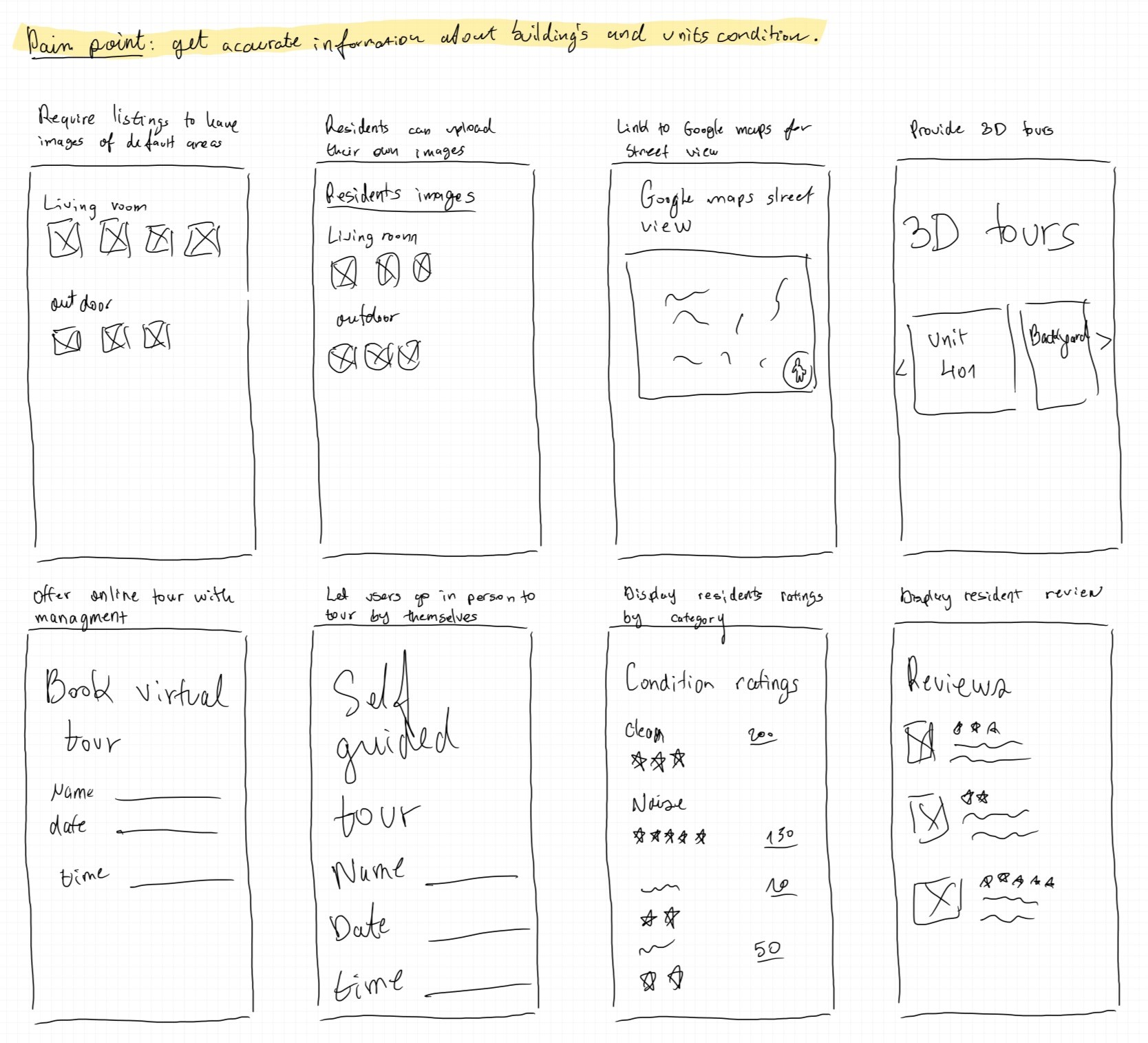
To consider different solutions to the user’s pain point of needing to know precisely as possible what the condition of the building is, I used the Crazy Eight method to encourage me to think about various solutions.
Starting the design
Paper & Digital wireframes | Low-fidelity prototype | Usability studies
Paper & digital wireframes: results page
Keeping in mind pain points from the user interviews, for the results page I prioritized:
1) Enabling the user to save and hide listings.
2) View properties highlights before diving in deeper.
3) Quick access to images and location map.
Low-fidelity prototype
To create a low-fidelity prototype, I connected the screens involved in the primary user flow of seeing all the information about a property and contacting the management for the next steps.

Usability study: parameters
Study type:
Unoderated
Location:
US, Remote
Participants:
5 participants
Length:
20-30 minutes per session
Usability study: findings
These were the main findings uncovered by the usability study:
Map
Actions on map were not noticed and map location on top was unfamiliar. Also, the additional map on the property listing section was redundant.
Page readability
A. Scanning the information in the listing-box was not as easy and fast as expected. B. The accordion in the apartment page didn't put users in a reading flow.
Information priority
The order of the information needs to improve to show the most sought-after information first.
Refining the design
Mockups | High-fidelity prototype | Accessibility
Mockup: Result page
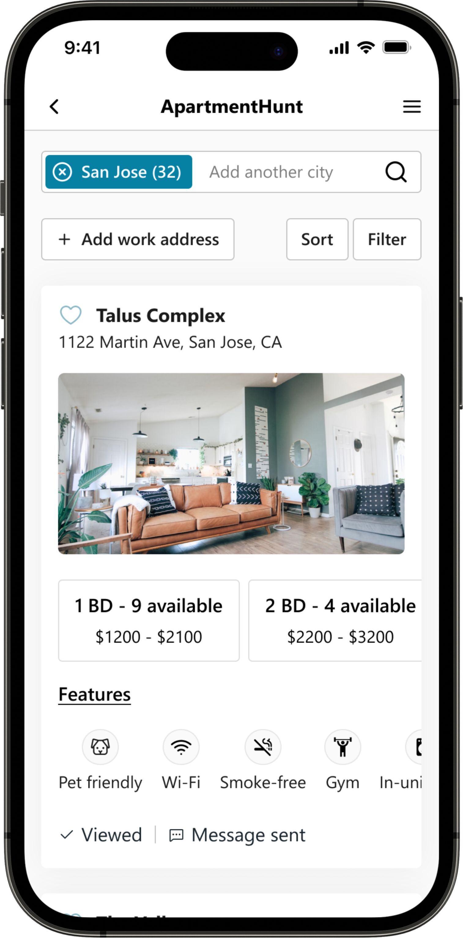
Based on the insights from the usability study, I made changes to improve the user experience.
Additions/changes to the design:
1) Option to set a work address for people to see how far properties are from their work.
2) ‘Hide’ label was replaced with ‘Viewed’ label to protect properties’ interests.
3) ‘Messaged’ label was added to help people track who they’ve contacted.
Mockup: Property page
Based on the insights from the usability study, I made changes to improve the user experience.
After the usability study, I discovered that the accordion designed on the property page to make the page uncluttered did not meet user expectations, so after some more research I decided to remove it to allow users to scroll down through the content.
Mockups
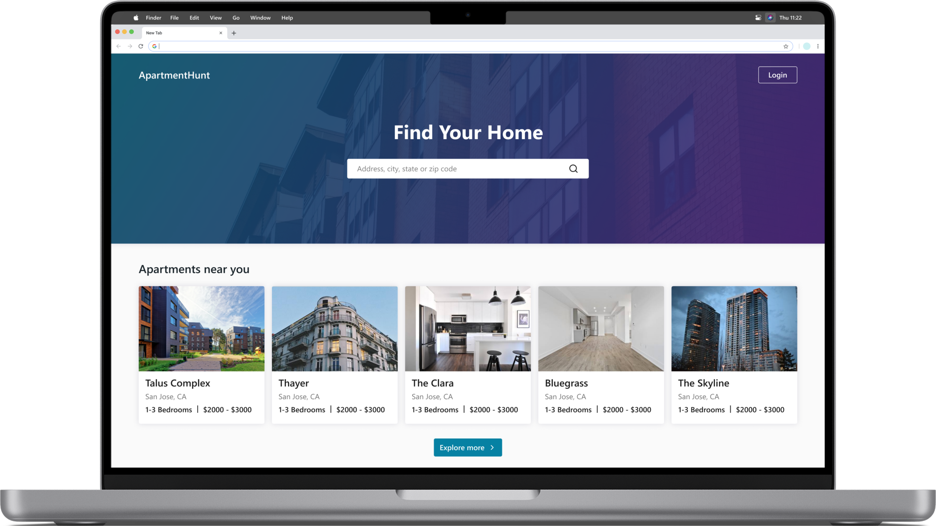
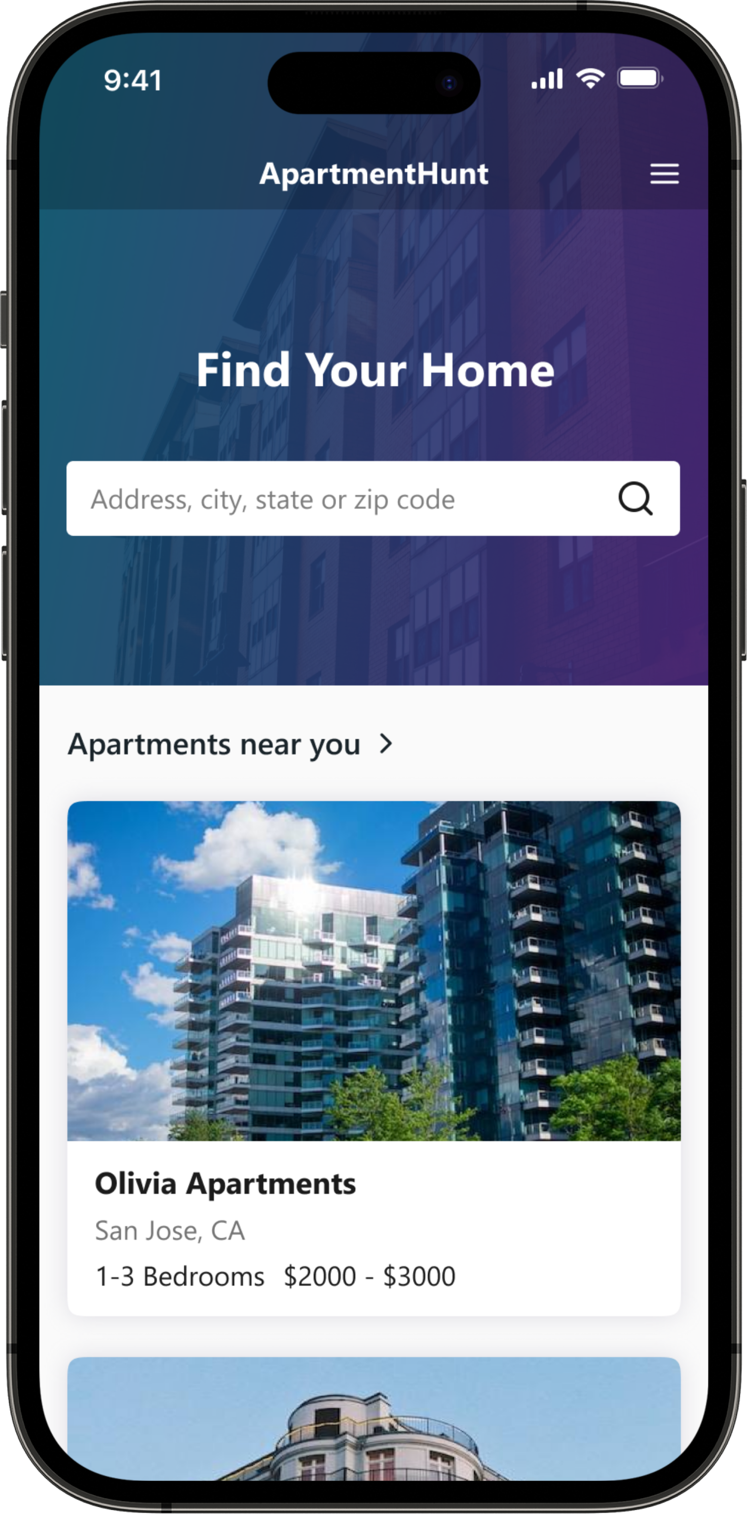
Home page
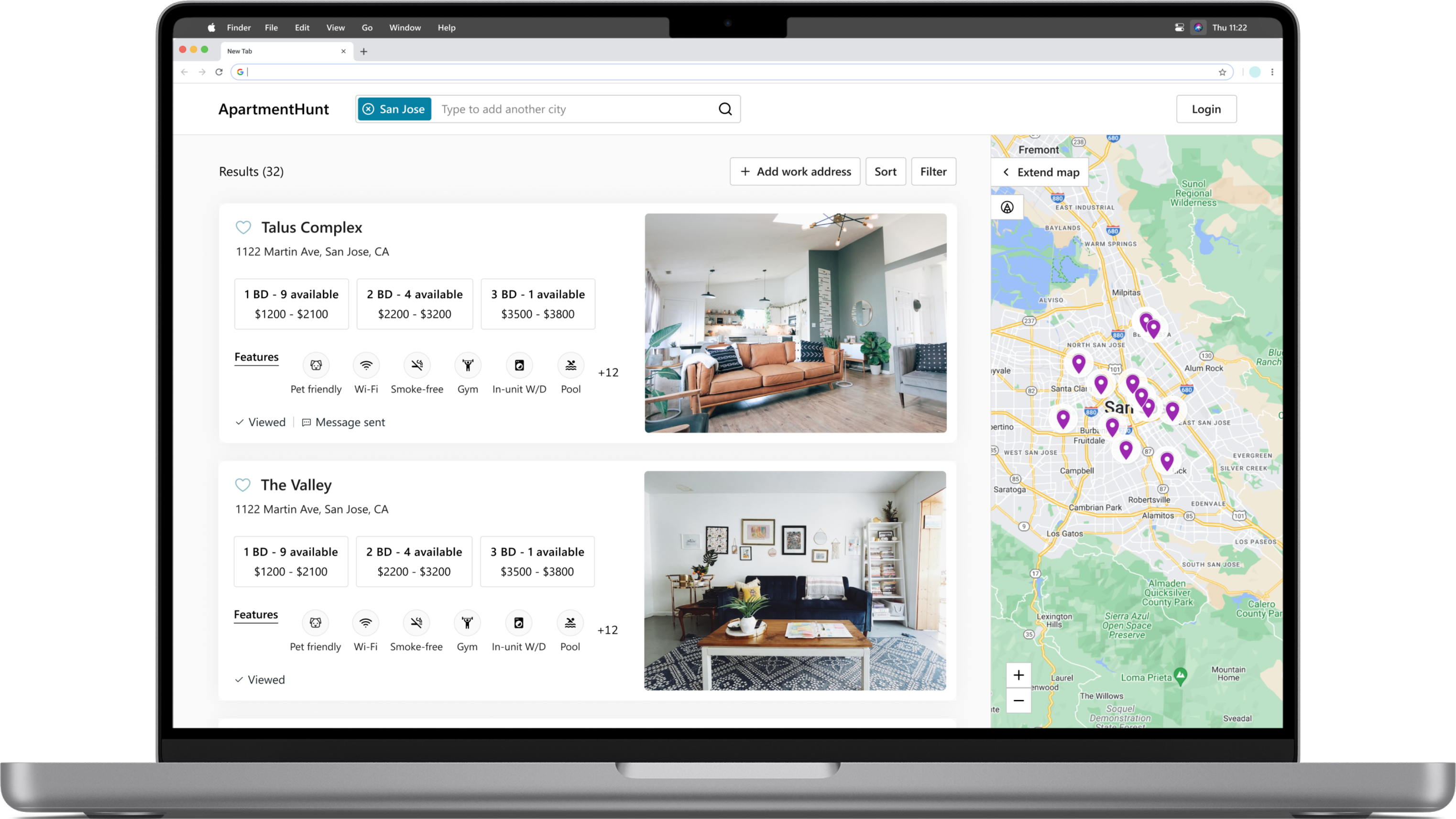
Results page
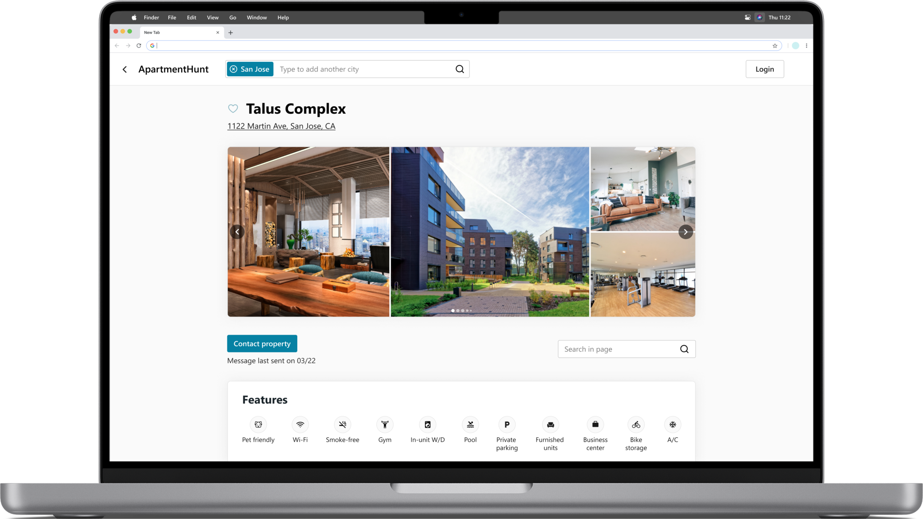
Property page
High-fidelity prototype
The high-fidelity prototype followed the same user flow as the low-fidelity prototype and include the design changes made after the usability study.

Accessibility considerations
Headings & labels were used to organize the content and support assistive technologies.
Color combinations with enough contrast were used so the content is easy to read, and main actions stand out.
Responsive Design
Sitemap | Responsive design
Responsive designs
to make the site fully responsive, I started working on designs for
additional screen sizes.
Going forward
Takeaways | Next steps
Takeaways
Impact:
The Apartment Hunt website provides users with additional features that cannot be found on other apartment search sites, such as progress tracking. It also represents the potential still available to further improve the experiences available today to meet the needs of different people.
What I learned:
During this design project I exercised thinking outside the box facing the challenge to innovate on an idea that is well established in the market where users have a variety of competing websites. I expanded my understanding of user diversity and priorities, leading me to a deeper understanding of the importance of usability studies to maximize user experience and reduce design bias. Also, by looking at how users scan information and what parts they are likely to ignore, it encouraged me to learn and focus even more on the intuitive path users take to achieve their goals. As a result, I refined the hierarchy to improve navigation so that users can complete their top priorities efficiently with as little time and effort as possible.


